")
Back to Journals » Journal of Pain Research » Volume 16
Exploring the Role of Pictograms in the Comprehension of Pain
Authors Merks P , Vaillancourt R, Dulai I, Lamontagne G, Pinkas J, Religioni U , Świetlik D, Kaźmierczak J, Blicharska E, Zender M, Cameron J
Received 11 May 2023
Accepted for publication 25 August 2023
Published 27 September 2023 Volume 2023:16 Pages 3251—3263
DOI https://doi.org/10.2147/JPR.S421035
Checked for plagiarism Yes
Review by Single anonymous peer review
Peer reviewer comments 3
Editor who approved publication: Dr Robert Twillman
Piotr Merks,1 Regis Vaillancourt,2 Irene Dulai,2 Gloria Lamontagne,3 Jarosław Pinkas,4 Urszula Religioni,4 Dariusz Świetlik,5 Justyna Kaźmierczak,6 Eliza Blicharska,7 Mike Zender,8 Jameason Cameron2
1Department of Pharmacology and Clinical Pharmacology, Faculty of Medicine, Collegium Medicum, Cardinal Stefan Wyszyński University in Warsaw, Warsaw, Poland; 2Pharmacy Department, Children’s Hospital of Eastern Ontario, Ottawa, Ontario, Canada; 3Biomedical Sciences Faculty, University of Ottawa, Ottawa, Ontario, Canada; 4School of Public Health, Centre of Postgraduate Medical Education of Warsaw, Warsaw, Poland; 5Department of Biostatistics and Neural Networks, Medical University of Gdansk, Gdansk, Poland; 6Zdrowit Sp. Z O.o, Pharmacy Chain, Piekary Śląskie, Poland; 7Department of Pathobiochemistry and Interdisciplinary Applications of Ion Chromatography, Medical University of Lublin, Lublin, Poland; 8School of Design, University of Cincinnati, Cincinnati, OH, USA
Correspondence: Urszula Religioni, School of Public Health, Centre of Postgraduate Medical Education of Warsaw, Kleczewska 61/63, Warsaw, 01-826, Poland, Tel +48225693700, Email [email protected]
Introduction: Pain is both difficult to see and to articulate and this is challenging for both patients and clinicians. The aim of this study was to develop and test pictograms to describe different pain qualities.
Methods: 22 pictograms were developed for evaluation based on pain qualities of the short form McGill Pain Questionnaire, version 2 (SF-MPQ-2). An online matching survey was conducted and disseminated via social media in 2021.
Results: An overall matching of 66% or higher between pictogram and pain qualities descriptors was considered a proper matching. This study was carried out internationally (males = 57, age=41y.o. ± 16; females = 155, age=41y.o.± 17) and in Poland (males=49, age =35y.o.± 17; females = 164, age=35y.o.± 16). There were 14 pictograms that did not achieve 66% matching in any country. 8 pictograms mutually in all subgroups achieved a matching score of ≥ 66% regardless of geographic location, sex, income, or education level.
Discussion and Conclusions: These 8 pictograms can be used clinically once they have been redrawn to improve consistency, and future research in the design of pictograms representing pain qualities of the SF-MPQ-2 should focus on design improvements for the remaining 14 pain qualities with poor comprehensibility.
Keywords: pain, pictograms, health literacy, SF-MPQ-2, pain comprehension
Introduction
The International Association for the Study of Pain (IASP) defines pain as “an unpleasant sensory and emotional experience associated with, or resembling that associated with, actual or potential tissue damage”.1 Despite being universal, pain is an individual and subjective experience in which patient perceptions of their pain can influence clinician interpretation and treatment.2 Diagnosing the causes of pain requires the clinician to fully understand specific qualities and characteristics of how the pain is subjectively interpreted by the individuals. However, those suffering from pain such as neuropathic or affective pain can have difficulties verbally describing the nuances of their pain experience,3 which can result in delays in diagnosis and undue suffering.4
Indeed, approximately 20% of adults in North America5,6 and 19% of adults in Europe,7 are suffering from chronic pain indicating a public health need for tools to help patients better communicate their pain experience.8 Not only do millions of people around the world suffer directly from inadequate pain management,9 health care providers working with chronic pain patients also experience high levels of emotional dissatisfaction and burnout due to the complexity of pain that renders many pain treatment plans ineffective.10
The quality of pain may be assessed using various pain assessment scales.11–13 but these scales have known limitations such as the lack of specificity and sensitivity.14 The multidimensional McGill Pain Questionnaire (MPQ) is a pain assessment tool that assesses major symptoms of neuropathic and non-neuropathic pain.15 A short-form version of the MPQ, the short form-MPQ version 2 (SF-MPQ-2) has been widely applied in the clinical management of pain in North America where patients rate 22 pain qualities on an 10-point scale to assess sensory and affective qualities, including continuous, intermittent, and neuropathic pain.14,15
Written information directed at patients often uses language that is difficult to interpret. Pictograms, which are symbols or drawings that represent a concept or idea, have the potential to aid in the assessment of pain when verbal description proves difficult for the patient. Although there are no comprehensive sets of pictograms that has been rigorously tested to depict common pain qualities, there are a small number of graphical tools/pictograms that have already been developed and tested in the United Kingdom and the Netherlands.8,16,17 Given the comprehensive nature of the SF-MPQ-2, with its inclusion of neuropathic pain qualities, and the long history of use of the MPQ and SF-MPQ in research and clinical settings,14,15 the SF-MPQ-2 was chosen for development of pictograms to illustrate each of its 22 pain descriptors.
Pictograms have demonstrated effectiveness in health communication to improve patient: attention to, comprehension of and recollection of information as well as improve treatment adherence.6,18–21 They are shown to be an effective adjunct to written information for patients who speak a different language or have low health literacy. If well developed and validated, pictograms have a real potential to support health literacy.22 The study of signs and symbols and the cultures that use them falls under the field of semiotics. Put simply, semiotics is the study of how an idea or object communicates meaning and what meaning it communicates.23,24
Patients’ cultural characteristics, such as values, age, gender and visual literacy, also affect the interpretation and the acceptance of the representation of information in pictograms.25 It is important to recognize that a pictogram can have different interpretations for different viewers. The aim of this study was to develop and test pictograms to accompany the SF-MPQ-2 with the goal of assessing at least 1 pictogram per pain quality that is defined by an overall matching of 66% or higher.26 Secondary objectives were to examine potential differences in ability to correctly match pain quality indicators in English- and Polish-speaking survey respondents.
Materials and Methods
This study was reviewed and approved by the Children’s Hospital of Eastern Ontario (CHEO) Research Ethics Board. Consent from participants was assumed if they completed the study questionnaire.
Pictogram Design
A semiotic analysis was first conducted to identify common graphic elements for each pain quality (23). Pharmacy students at CHEO performed initial stages of semiotic analysis. Via a simple google image search, a minimum of 18 relevant images were selected for each of the 22 pain quality descriptors. Common key graphic elements of the images for each pain quality descriptor were tabulated and sent to a graphic design school at the University of Cincinnati to create illustrations. With a large image bank, obtained from the school of graphic design, the research team selected the five pictograms to represent each of the 22 pain quality descriptors for further selection.
The whole study duration was 15.12.2021–31.06.2022. Recruitment for a preliminary round of image selection occurred at the CHEO main cafeteria where visiting adults or employees working at CHEO who could read and understand English were presented with each pain quality on a separate page of a paper-and-pencil questionnaire with five image variants arranged in a circle around the pain quality descriptor. Participants were then asked to write down the percentage of people who would correctly guess the meaning of each image describing the pain quality. For any pictogram that did not receive a mean rating of at least 50%, new pictograms were designed based on participants’ feedback. The new pictograms were substituted into the existing panel of pictograms. There was a total of 2 rounds of selection validation and from these 2 rounds, the pictogram with the highest mean rating for each pain quality descriptor was selected. These pictograms were then tested via an online matching test.
Matching Test—Online Questionnaire
An online matching test was developed to assess comprehensibility of each of the 22 pictograms. The goal of the matching survey was to properly link each pictogram with the correct pain quality. Online recruitment via social media platforms (eg Facebook, Twitter, Instagram) was employed to distribute the survey via a secure REDCap survey link containing the information sheet and the matching tests for the pain pictogram images.
Participants were presented with each pictogram separately, one pictogram at a time. Participants were asked the following question: “Select the type of pain that you believe each pictogram best illustrates. Each pictogram only has one match.” They had to choose from 8 answers that could possibly describe the pain quality in the pictogram. For each pictogram the 7 incorrect answers were randomized from the list of 22 pain qualities being tested. All participants who completed the survey viewed the pictograms in the same order. The pictograms were considered validated if they reached proper matching at 66% as adapted from ISO standard 9186–2 criterion of acceptability of 66% or more for public information symbols.26
A Polish version of the survey was created by translating the English version of the survey via a third-party professional agency. The translated questionnaire was then validated by 2 Polish pharmacists and 2 medical doctors specialized in the field of pain to ensure all information in the questionnaire was accurate. The online survey developed in English in Canada was distributed internationally while the Polish version of the survey was only distributed in Poland.
Demographic Sub Analysis
The demographic data collected consisted of the participant’s country of origin, sex, education level and income level. The online survey was designed to allow participants to skip demographic questions if they did not wish to disclose that information.
Participants were then divided into four categories in order to analyse the impact of geographic location on the understanding of pictograms. Participants who answered the survey in English were divided into three categories: International, North-America and non-North America. The “International” group represents all participants from various countries except Poland. The “North-America” group was a sub-group of the “International” group and included participants from USA and Canada. The “non-North America” group was another sub-group of the “International” group and contained participants from other countries with the exception of USA and Canada. The “Poland” group was an isolated group of all participants who answered the survey in Polish.
An analysis was then performed to compare and identify many aspects including the impact of sex, the level of education and the source of income on the comprehension of pictograms. Each demographic question (sex, education, income) was dichotomized. Low education was defined as individuals who have less than a high school education, completed high school education or have some college education. High education was specified as individuals who have completed college, have a bachelor’s or a graduate’s degree. Low income was defined as income less than $60,000 and high income was defined as income greater than $60,000. For the survey in Poland, once currency was converted to CAD to get equivalent ranges, one option was $52,053.60 - $65,067.00; this option was included in the low income level to allow for some consistency between the two surveys.
Descriptive statistics were used to characterize the sample, with means and standard deviations used for continuous data. Two-tailed t-tests were performed for mean comparisons where the P-value cut-off for significance was set at <0.05.
Results
Of the 22 pictograms tested which achieved matching scores of 66% or more; 15 pain pictograms passed this threshold in the International group (ie cold-freezing pain, hot-burning pain, tingling pain/pins and needles, cramping pain, heavy pain, electric-shock pain, sickening pain, exhausting pain, gnawing pain, itching pain, throbbing pain, shooting pain, stabbing pain, punishing pain and splitting pain) and 9 pain pictograms in the Poland group (ie cold-freezing pain. Hot-burning pain, cramping pain, heavy pain, electric-shock pain, sickening pain, exhausting pain and itching pain). There were 8 pictograms that mutually achieved the 66% threshold in both the English and Polish surveys: cold-freezing pain, hot-burning pain, cramping pain, heavy pain, electric-shock pain, sickening pain, exhausting pain, gnawing pain and itching pain.
There were 6 pictograms (tingling pain/pins and needles, gnawing pain, throbbing pain, shooting pain, stabbing pain, punishing pain, splitting pain) that were matched correctly and achieved greater than 66% in the English survey that did not reach this threshold in the Polish survey. There was only one pictogram in the Polish survey (numbing pain) that had a mean comprehensibility rating >66% that was not over 66% in the English survey (See Table 1).
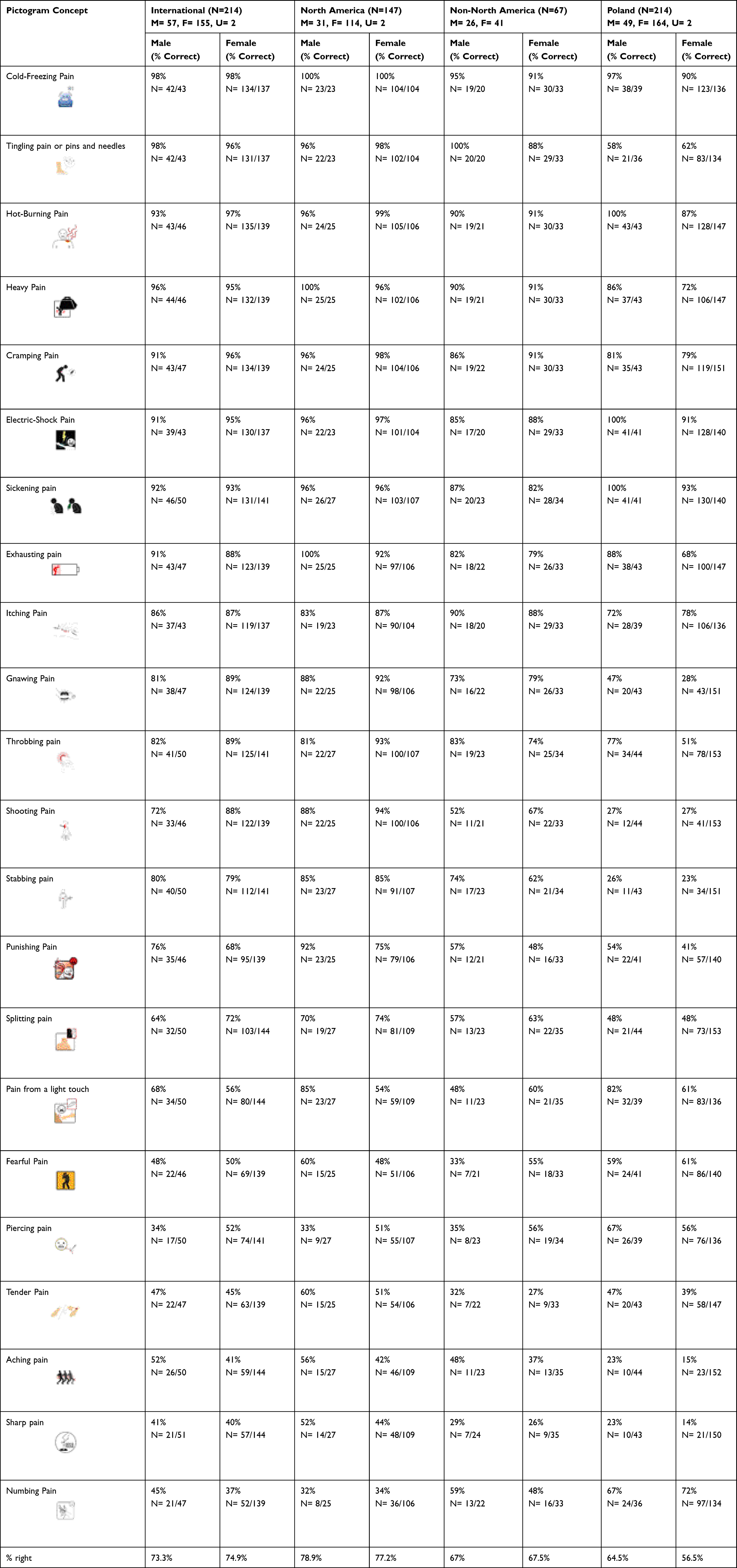 |
Table 1 Pictogram Successful Matching Score by Sex and Origin of Participants |
English Survey Results
The total number of participants who answered all the demographics questions in the English survey was 212 (55 males; 154 female). The number of participants who answered each question varied between 43 to 51 for males and 137 to 144 for females. 50 of the 212 total participants had low education and 162 had high education. The number of participants who answered each question varied between 41 to 44 for low education and 139 to 151 for high education. Lastly, 81 participants had lower income and 91 participants had higher income. The number of answers for each question varied between 72 and 74 for low income and 78 to 88 for high income.
In the international group (all participants who answered the English survey), results of the T test analysis showed a sex effect for 2 pictograms where males demonstrated significantly lower matching scores for shooting pain (male=72%, female=88%, p=0.031) and piercing pain (male=34%, female=52%, p=0.002).
There was also an education effect in the International group for hot-burning pain (low education = 88%, high education = 99%, p=0.049), cold-freezing pain (low education = 100%, high education = 97%, p=0.045), punishing pain (low education = 53%, high education = 75%, p=0.013) and tender pain (low education = 30%, high education = 50%, p=0.017).
There was also an income effect in the International group for cold-freezing pain (low income = 94%, high income = 100%, p=0.045),), throbbing pain (p=0.010, low income = 82%, high income = 95%), gnawing pain (low income = 86%, high income = 96%, p=0.027), punishing pain (low income = 61%, high income = 79%, p=0.014) and shooting pain (low income = 76%, high income = 94%, p=0.003).
North American Results
Pictograms that showed a significant sex effect in the North America group include: exhausting pain (male=100%, female=92%, p=0.002), heavy pain (male=100%, female=96, p=0.045), pain from a light touch (male=85%, female=54%, p<0.001) and punishing pain (male=92%, female=75%, p=0.015).
There was also an education effect for matching scores in the North American group for tender pain (low education = 29%, high education = 61%, p=0.001) and punishing pain (low education = 59%, high education = 85%, p=0.008).
For income, throbbing pain (low income=85%, high income=99%, p=0.026) was the only pictogram that showed a significant difference in the North America group.
Non-North American Results
For the non-North America group, tingling pain/pins and needles (male=100%, female=88%, p=0.043) was the only pictogram that showed a significant sex effect.
Cold-freezing pain (low education = 100%, high education =91%, p=0.044) was the only pictogram that showed a significant education effect.
There was also an income effect in the non-North American group for cold-freezing pain (low income = 8%, high income=100%, p=0.043), itching pain (low income =88%, high income=100%, p=0.043), shooting pain (low income = 50%, high income = 100%, p<0.001), pain from a light touch (low income = 47%, high income=79%, p=0.037), stabbing pain (low income = 63%, high income=92%, p=0.014) and gnawing pain (low income = 81%, high income = 100%, p=0.011).
Polish Survey Results
The total number of participants who answered the sex demographic question was 214 (males=49, females=164). The number of participants who answered each question varied between 35 to 44 for males and 134 to 153 for females. 73 of the 217 participants who answered the education level demographic question had lower education and 137 had higher education. The number of participants who answered each question varies between 55 to 64 for low education and 112 to 127 for high education. Of the 216 participants who answered the income demographic question, 145 participants had lower income and 19 had higher income. The number of answers for each question varies between 114 to 132 for low income and 16 to 18 for high income.
Poland showed the most pictograms that had a significant sex effect: exhausting pain (male=88%, female=68%, p=0.001), heavy pain (male=86%, female=72%, p=0.035), hot-burning pain (male=100%, female=87%, p<0.001), sickening pain (male=100%, female=93%, p=0.001), electric-shock pain (p=0.0004, M=100%, F=91%), throbbing pain (male=77%, female=51%, p<0.001) and pain from a light touch (male=79%, female=61%, p=0.020).
Numbing pain (low education = 57%, high education = 77%, p=0.009) was the only pictogram that showed an education effect.
There was also an income effect in the Poland group for sickening pain (low income = 91% and high income = 100%, p<0.001), tingling pain/pins or needles (low income = 56%, high income = 93%, p<0.001), numbing pain (low income=70%, high income=94%, p<0.001) and aching pain (low income=19%, high income=0%, p<0.001).
Discussion
Via a survey of English and Polish respondents who all completed the same pictogram matching task, the current study assessed the overall comprehensibility of pictograms representing the 22 pain indicators of the SF-MPQ-2. In the combined overall sample, there were a total of 16 pain quality indicators for which the associated pictogram achieved matching scores of ≥66%. When examined by group, 15 pictograms passed this threshold for matching scores in the International Group, 15 pictograms for the North-American group, 12 pictograms in the non-North America group and 9 pictograms in the Poland Group.
Regarding the potential impact of geographic location and cultural differences in the interpretation of the pain represented in each pictogram, there was a convergence on 8 pictograms that achieved the 66% threshold in both the English and Polish surveys. In Enass et als.4 description of the process of understanding of the composition of pictograms, they identify a concept called the semiotic triangle. To correctly understand the intended meaning of a pictogram, it is necessary to correctly understand the image itself, then to associate it with the correct concept, and finally to correctly relate this concept to the situation.4 That there were 8 pain indicators that met or surpassed the 66% threshold score of successfully matching the indicator with the pictogram suggests that these 8 images have met each dimension of the semiotic triangle, and can be further tested for the eventual employment in clinical settings.
Patient factors such as health literacy, language barriers, and socio-economic factors all influence communication with healthcare professionals.27 Our data did display this expected difference in the interpretation of pain indicators, where the International Group had a higher proportion of pictograms that met the threshold for matching scores than did the Poland Group (15/22 vs 9/22, respectively). Indeed, pictograms have already been shown to help improve communication between the patient and the healthcare professional15,28 and studies have shown that pictograms tested and employed in specific populations tend to be better understood by individuals from the geographical area studied or with similar cultural elements.12,15,29,30
Our data further specifies the need to consider cultural elements when designing health-related pictograms such as those for pain assessment. For example, for the punishing pain pictogram, participants who completed the Polish survey had poorer scores for each category when compared to the English survey. This pictogram’s primary concept is painful punishment which is signified using the color red. In Canada, red can signify danger, pain and violence,31 hence the use of a red colored background, whip, wounds and a red face to emphasize the punishing action resulting in pain. In contrast, in Poland red means valor and sacrifice.13 The pictogram can therefore be misleading for the Polish population since it could be interpreted as an individual being courageous rather than suffering/being punished. These findings support the notion that pictograms are generally better understood when they fit the culture of the target population.
Despite showing statistically significant differences as per results of the T test analysis, there was no clinically significant (ie not greater than 10% difference in matching score) sex effect for respondents of the English survey. Females had a more accurate understanding of 11 pictograms compared to males who more accurately comprehended 10 pictograms, and one pictogram (cold-freezing pain) was equally understood by both sexes (See Table 1). In the English survey, the overall difference between both sexes was less than 2% and there was no overall clinically significant difference between males and females’ answers for the International, North America and non-North America groups.
In contrast, a study about safety pictograms showed males’ comprehension of pictograms was higher than females.32 This can be seen in the Polish survey, where the average percentage of right answers for the survey was higher for males than for females. In the Polish survey, males had a more accurate understanding of 16 pictograms compared to females who had a more accurate grasp of only 4 pictograms and 2 pictograms were equally understood between both sexes (see Table 1). The results of our T test analysis also support this finding as the pictograms for hot-burning pain, heavy pain and exhausting pain all reached the mean matching rating of >66% yet there was a clinically significant difference greater than 10% between sexes with males having a higher percentage of correct answers. Overall, however, neither sex passed the threshold requirement nor had a small percentage difference (<10%) between sexes in the Polish survey indicating that there was a clinically significant sex effect within the Poland group.
In our data, it was observed that participants with a higher education generally had a more accurate understanding of the pictograms than those with a lower education. The difference for the average percentage of correct answers across all groups ranged between 4% and 12.3%. The results of the T test show that for all groups studied, the difference between the percentages of individuals who correctly identified the majority of the pictograms was greater than 10%, with individuals who have a higher education having a higher percentage of correct answers. Pictograms, in addition to text-based information, have already been shown to significantly enhance the comprehension of health information in poorly educated populations.15 However, pictograms are not always well understood by patients, regardless of education level. It has been suggested that the success of a pictogram to communicate information is determined largely by the extent of an individual’s degree of visual literacy, which is the ability to create and use visual symbols for communicating and thinking.15,33,34 This skill is most commonly acquired through exposure to pictorial materials and visual media, which may be limited in individuals with a low level of education/income, especially those coming from or living in developing countries.15 Within each group in our dataset, the difference between the success rate of low and high education participants was less for pictograms that reached the matching threshold criterion and larger for pictograms that did not reach it. Our data therefore supports the observation that there is a strong correlation between the level of education of an individual and their ability to accurately interpret a pictogram. With lower educational preparation, features that are critical in a pictogram can be missed, which can result in misinterpretation of the pictogram.10
Interestingly, low-income individuals, mostly those coming from developing countries, are more likely to gain information and knowledge from television rather than written material.35 Therefore, it can be suggested that being exposed to mainly pictorial materials and visual media may help improve one’s visual literacy. Another observation made is that participants with higher income better understood pictograms than those with lower income in the International and North America group. The difference for the average percentage of correct answers for each group ranged between 1.7% and 10.9%. For each group, however, the difference between the success rate of low and high income participants was smaller for pictograms who reached the 66% criterion and larger for pictograms that did not reach the standard. For the non-North America group overall, 65.5% of low-income and 76.4% of high-income participants correctly identified the 22 pictograms. The percentage for the low-income group almost reached the pre-set threshold but not quite. This could be explained by the lack of literacy. Low-income individuals may be more exposed to visual material, however, having insufficient education and background knowledge could cause features in visual presentation to be missed or misunderstood, rendering the pictogram incomprehensible.34 In fact, for the same group, 57.1% of low education and 69.4% of high education participants answered all 22 pictograms correctly.
Several limitations during this study have been identified. Since the survey was completed online, participants were able to exit the questionnaire at any time without completing all questions. The same pictograms were employed for the English and Polish surveys, but the pictograms were first designed in the USA and later refined in Canada, thus the context of cultural nuances in pain interpretation remained as an extraneous variable. In addition, the final matching survey completed by participants was designed in a fixed order meaning not all 22 pictograms were shown at the same time. Although the images were randomized to generate the survey, they were presented in the same order for each individual. This increased the likelihood of order effects17 as demonstrated by the greater percentage of accurate response rates of pictograms towards the end of the International matching survey (last 5 pictograms=96%, 96%, 86%, 98%, 94%) compared to pictograms in the beginning of survey (first 5 pictograms=44%, 58%, 69%, 39%, 79%). This indicates that a bias may have been introduced as the participant may have learned by doing the survey. Moreover, the majority of the International group is composed of North American participants. This could have skewed the International data in favor of North America. Furthermore, since the pictograms were designed by Canadians, participants from North America had a considerable advantage answering the survey compared to non-North America and Polish participants. This bias could have affected the data collected in Poland because the pictograms were not adapted for foreign participants.
Limitations of the Study
Like all research, ours also has limitations. First of all, it should be emphasized that the online recruitment of the sample did not allow to obtain the opinion of a representative group of the population. In addition, such a method of sampling does not allow for generalizations and broad conclusions. Thus, further research in this area is necessary in order to assess the understanding of pictograms among a wide range of recipients, including diversified in terms of demographic characteristics.
Conclusions
Regarding the potential impact of geographic location and cultural differences in the interpretation of the pain qualities of the SF-MPQ-2 represented in each pictogram, a total of 8 pictograms (cold-freezing pain, hot-burning pain, cramping pain, heavy pain, electric-shock pain, sickening pain, exhausting pain, gnawing pain and itching pain) achieved the 66% threshold in both the English and Polish surveys (combined groups). These 8 pain pictograms can be used clinically once they have been redrawn to improve consistency, and future research in the design of pictograms representing pain qualities of the SF-MPQ-2 should focus on design improvements for the remaining 14 pain qualities with poor comprehensibility, with considerations on examining the sex differences in responding for the Polish respondents.
Ethics Approval and Informed Consent
This study was reviewed and approved by the Children’s Hospital of Eastern Ontario (CHEO) Research Ethics Board. Consent from participants was assumed if they completed the study questionnaire. We confirm that our study complies with the Declaration of Helsinki.
Consent for Publication
We confirm that the details of any images, videos, recordings, etc can be published.
Acknowledgment
SF-MPQ-2 contact information and permission to use: Mapi Research Trust, Lyon, France, https://eprovide.mapi-trust.org.
Author Contributions
All authors made a significant contribution to the work reported, whether that is in the conception, study design, execution, acquisition of data, analysis and interpretation, or in all these areas; took part in drafting, revising or critically reviewing the article; gave final approval of the version to be published; have agreed on the journal to which the article has been submitted; and agree to be accountable for all aspects of the work.
Funding
There is no funding to report.
Disclosure
The authors report no conflicts of interest in this work.
References
1. Raja SN, Carr DB, Cohen M, et al. The revised International Association for the Study of Pain definition of pain: concepts, challenges, and compromises. Pain. 2020;161(9):1976–1982. doi:10.1097/j.pain.0000000000001939
2. Breivik H, Borchgrevink PC, Allen SM, et al. Assessment of pain. Br J Anaesth. 2008;101(1):17–24. doi:10.1093/bja/aen103
3. Dworkin RH, Turk DC, Revicki DA, et al. Development and initial validation of an expanded and revised version of the Short-form McGill Pain Questionnaire (SF-MPQ-2). Pain. 2009;144(1–2):35–42. doi:10.1016/j.pain.2009.02.007
4. Enass MMH. The semiotics of pictogram in the Signage Systems. Int Design J. 2015;5(2):301–315. doi:10.21608/idj.2015.101372
5. Dahlhamer J, Lucas J, Zelaya C, et al. Prevalence of Chronic Pain and High-Impact Chronic Pain Among Adults - United States, 2016. MMWR Morb Mortal Wkly Rep. 2018;67(36):1001–1006. doi:10.15585/mmwr.mm6736a2
6. Richler M, Vaillancourt R, Celetti SJ, Besançon L, Arun KP, Sebastien F. The use of pictograms to convey health information regarding side effects and/or indications of medications. J Commun Healthc. 2012;5:220–226. doi:10.1179/1753807612Y.0000000012
7. Breivik H, Collett B, Ventafridda V, Cohen R, Gallacher D. Survey of chronic pain in Europe: prevalence, impact on daily life, and treatment. Eur J Pain. 2006;10(4):287–333. doi:10.1016/j.ejpain.2005.06.009
8. Stones C, Knapp P, Closs SJ. Creating a better picture of chronic pain: improving pain pictogram designs through systematic evaluation of user responses. Br J Pain. 2016;10(4):177–185. doi:10.1177/2049463716657365
9. King NB, Fraser V. Untreated pain, narcotics regulation, and global health ideologies. PLoS Med. 2013;10(4):e1001411. doi:10.1371/journal.pmed.1001411
10. Glauser W. Challenges of treating chronic pain contributing to burnout in primary care. CMAJ. 2019;191(29):E822–E823. doi:10.1503/cmaj.109-5774
11. Closs SJ, Barr B, Briggs M, Cash K, Seers K. A comparison of five pain assessment scales for nursing home residents with varying degrees of cognitive impairment. J Pain Symptom Manage. 2004;27(3):196. doi:10.1016/j.jpainsymman.2003.12.010
12. Grenier S, Vaillancourt R, Pynn D, et al. Design and development of culture-specific pictograms for the labelling of medication for first nation communities. J Commun Healthc. 2011;4(4):238–245. doi:10.1179/1753807611Y.0000000007
13. What do the colors on the Polish flag mean? Available from: https://www.nzoliborz.pl/co-oznaczaja-kolory-na-fladze-polski/,04.02.2023.
14. Cruccu G, Sommer C, Anand P, et al. EFNS guidelines on neuropathic pain assessment: revised 2009. Eur J Neurol. 2010;17(8):1010–1018. doi:10.1111/j.1468-1331.2010.02969.x
15. Kassam R, Vaillancourt R, Collins JB. Pictographic instructions for medications: do different cultures interpret them accurately? Int J Pharm Practice. 2004;12(4):199–209. doi:10.1211/0022357044698
16. Closs SJ, Knapp P, Morley S, Stones C. Can pictorial images communicate the quality of pain successfully? Br J Pain. 2015;9(3):173–180. doi:10.1177/2049463715569805
17. Knegt NC, De Schuengel C, Lobbezoo F, Visscher CM, Evenhuis HM. Comprehension of pictograms for pain quality and pain affect in adults with Down syndrome. Int J Med. 2016;41:222–232.
18. Houts PS, Doak CC, Doak LG, Loscalzo MJ. The role of pictures in improving health communication: a review of research on attention, comprehension, recall, and adherence. Patient Educ Couns. 2006;61(2):173–190. doi:10.1016/j.pec.2005.05.004
19. Katz MG, Kripalani S, Weiss BD. Use of pictorial aids in medication instructions: a review of the literature. Am J Health Syst Pharm. 2006;63(23):2391–2397. doi:10.2146/ajhp060162
20. Peregrin T. Picture this: visual cues enhance health education messages for people with low literacy skills. J Am Diet Assoc. 2010;110(4):500–505. doi:10.1016/j.jada.2010.02.019
21. Re L. Pictograms: can They Help Patients Recall Medication Safety Instructions ? Visible Lang. 2016;50:127–151.
22. Merks P, Świeczkowski D, Balcerzak M, et al. The evaluation of pharmaceutical pictograms among elderly patients in community pharmacy settings - a multicenter pilot study. Patient Prefer Adherence. 2018;12:257–266. doi:10.2147/PPA.S150113
23. Korenevsky A, Vaillancourt R, Pouliot A, et al. How Many Words Does a Picture Really Tell? Cross-sectional Descriptive Study of Pictogram Evaluation by Youth. Can J Hosp Pharm. 2013;66(4):219–226. doi:10.4212/cjhp.v66i4.1269
24. Thibault P. Re-Reading Saussure: The Dynamics of Signs in Social Life. London (UK): Routledge; 1996.
25. Spinillo CG. Graphic and cultural aspects of pictograms: an information ergonomics viewpoint. Work. 2012;41 Suppl 1:3398–3403. doi:10.3233/WOR-2012-0615-3398
26. ISO. Graphical symbols—Test methods—Part 1: Methods for Testing Comprehensibility. Geneva: International Organization for Standardization; 2007.
27. Tina M. Symbols On The Airoplane: a Semiotic Study. J Industri Elektro dan Penerbangan. 2020;3(1):57.
28. Lindquist LA, Go L, Fleisher J, Jain N, Friesema E, Baker DW. Relationship of health literacy to intentional and unintentional non-adherence of hospital discharge medications. J Gen Intern Med. 2012;27(2):173–178. doi:10.1007/s11606-011-1886-3
29. Barros IM, Alcântara TS, Mesquita AR, Santos AC, Paixão FP, Lyra DP. The use of pictograms in the health care: a literature review. Res Social Adm Pharm. 2014;10(5):704–719. doi:10.1016/j.sapharm.2013.11.002
30. Goel G. A comparative study to evaluate patients interpretation of USP and locally designed pharmaceutical pictograms. Pharma Times. 2010;42(6):16–19.
31. Davies S, Haines H, Norris B, Wilson JR. Safety pictograms: are they getting the message across? Appl Ergon. 1998;29(1):15–23. doi:10.1016/S0003-6870(97)00021-5
32. Baker DW, Parker RM, Williams MV, et al. The health care experience of patients with low literacy. Arch Fam Med. 1996;5(6):329–334. doi:10.1001/archfami.5.6.329
33. Vaillancourt R, Cameron JD. Health literacy for children and families. Br J Clin Pharmacol. 2022;88(10):4328–4336. doi:10.1111/bcp.14948
34. Dowse R, Ehlers MS. The evaluation of pharmaceutical pictograms in a low-literate South African population. Patient Educ Couns. 2001;45(2):87–99. doi:10.1016/S0738-3991(00)00197-X
35. Weiss BD, Reed RL, Kligman EW. Literacy skills and communication methods of low-income older persons. Patient Educ Couns. 1995;25(2):109–119. doi:10.1016/0738-3991(95)00710-H
 © 2023 The Author(s). This work is published and licensed by Dove Medical Press Limited. The full terms of this license are available at https://www.dovepress.com/terms.php and incorporate the Creative Commons Attribution - Non Commercial (unported, v3.0) License.
By accessing the work you hereby accept the Terms. Non-commercial uses of the work are permitted without any further permission from Dove Medical Press Limited, provided the work is properly attributed. For permission for commercial use of this work, please see paragraphs 4.2 and 5 of our Terms.
© 2023 The Author(s). This work is published and licensed by Dove Medical Press Limited. The full terms of this license are available at https://www.dovepress.com/terms.php and incorporate the Creative Commons Attribution - Non Commercial (unported, v3.0) License.
By accessing the work you hereby accept the Terms. Non-commercial uses of the work are permitted without any further permission from Dove Medical Press Limited, provided the work is properly attributed. For permission for commercial use of this work, please see paragraphs 4.2 and 5 of our Terms.