Back to Archived Journals » International Journal of Wine Research » Volume 10
The colors of wine
Authors Fairchild MD ![]()
Received 8 January 2018
Accepted for publication 1 February 2018
Published 23 March 2018 Volume 2018:10 Pages 13—31
DOI https://doi.org/10.2147/IJWR.S161891
Checked for plagiarism Yes
Review by Single anonymous peer review
Peer reviewer comments 3
Editor who approved publication: Dr Roger Pinder
Video abstract presented by Mark D Fairchild.
Views: 650
Mark D Fairchild
Program of Color Science/Munsell Color Science Laboratory, Rochester Institute of Technology, Rochester, NY, USA
Purpose: This work examined the color measurement and color appearance of wine under various illumination types in order to assess the importance of illumination in the sensory evaluation of wine.
Materials and methods: Six finished retail wines were measured in 8 different spectrophotometric and spectroradiometric geometries, both in analytical cuvettes and International Organization for Standardization tasting glasses. The resulting spectral transmittance data were analyzed colorimetrically using 2 color spaces (Commission Internationale de l’Eclairage L*a*b* and Commission Internationale de l’Eclairage Color Appearance Model 02) to examine the effects of both measurement geometry and viewing condition on the appearance of wines.
Results: The results clearly indicate that measurement geometry is critical in wine color assessment and that the lighting used to view wines, as well as the lighting levels, can have significant impact on the perceived colors of wines and ultimately the judgments made in sensory evaluation procedures.
Conclusion: Standardization of lighting type, level, spectral characteristics, and geometry are needed for careful and consistent sensory evaluation of wine color. Recommendations are made for a relatively simple way to achieve this.
Keywords: colorimetry, illumination, appearance, sensory evaluation
Introduction
Red, white, pink, yellow, or orange color is one of the most fundamental descriptors of wine. It is one of the attributes of wine that viticulturists and winemakers dedicate their constant care, attention, patience, and nurturing to, in both growing grapes and making wine. Even after harvest, there is much that can be done, and is done, to coax wine colors from the grapes into their full potential and expression in the wine. Aging also has its clear, and often desirable, impact on color such that the ultimate experience of the drinker taps into the haunting, brilliant, thrilling, subtle, and ancient history of the beverage. But how is color evaluated, controlled, assessed, and ultimately experienced? This paper examines some of the variables of color, most critically the illumination level and lighting color, and explores their potential impact on wine sensory evaluation.
While the vast majority of wine volume is made up of water and alcohol, the remaining fractional percentage provides each wine with unique colors, aromas, and flavors (neglecting any residual sugar). Most of that fractional percentage is made up of phenolic compounds.1 Kennedy et al1 provide a historical review of the importance of, and research examining, phenolics. With respect to color appearance in wine, 2 types of phenolics are paramount. These are the anthocyanins that provide much of the pH-sensitive (higher pH is more purple) color of red wines and the flavonols that largely control the color of white wines. Large amounts of research have been done on anthocyanins in grapes and wine due to their unique properties and relatively high concentrations.1 Concentrations of phenolics in grape juice or wine can be determined using traditional techniques of analytical spectroscopy. When color is the main interest, this entails visible-light spectrophotometry in which the percentage of light transmitted straight through a liquid sample in a cuvette of specified thickness is measured across the visible wavelengths. These measurements can then be used as the basis of colorimetric analyses.
Rolle and Guidoni2 provide a detailed review of both the importance of anthocyanin measurement in red wine grapes and the use of a standard colorimetric space, Commission Internationale de l’Eclairage L*a*b* (CIELAB), to quantify the grape color for vineyard management and winemaking decisions. In particular, they derived a Color Index for Red Wine Grapes that is simply computed from CIELAB lightness (L*), yellowness–blueness (b*), and hue (hab) and correlates very well with Total Anthocyanin Index in the berry skins as evaluated across a number of cultivars. Their results show that colorimetric parameters can be used as a simpler shortcut for spectrophotometric analyses in important wine variables. Such colorimetric parameters are utilized in the current research.
Examined are 2 key aspects of objective color measurement. The first is the geometry of the wine sample and the measurement illumination and detection. The second is the illumination under which the wine color is evaluated and its effect on both instrumental and sensory, or visual, analysis, and then ultimately the sensory evaluation and consumer experience of the wine itself. The next 2 sections provide introductory overviews of these 2 key components of color measurement.
Wine color measurement
In general, color measurements depend on a few key factors. These are the physical geometry of the illumination and viewing of the measuring device, the geometrical configuration of the sample (e.g., size, thickness) being measured, and the measurement area. Once the spectrophotometric measurements are complete, colorimetric parameters are computed to specify the sample color and these depend on the illuminant and observer functions used in the computation as well as the selection of the color matching, tolerance, or appearance space.3,4 For this research, 2 different spectrophotometric approaches were explored, one in analytical cuvettes using a visible transmission spectrophotometer and a second in situ with wine samples in tasting glasses under room-like illumination and a spot spectroradiometer. Historically, both types of measurements have been employed.
The spectrophotometric measurements were further analyzed using colorimetric parameters in 2 color spaces, CIELAB and Commission Internationale de l’Eclairage Color Appearance Model (CIECAM02).5 CIELAB is by far the most commonly used color space across all industries. The CIELAB space, published in 1976, accounts for the sample, the illumination, and the observer to predict values that correlate with perceived lightness (L*), chroma (C*), hue (hab), and redness–greenness (a*) and yellowness–blueness (b*), which directly define chroma and hue. CIELAB is most commonly used to measure color differences and define tolerances for color accuracy. CIECAM02, published in 2002, is a more modern color appearance space. It also accounts for additional viewing conditions such as the level of illumination and degree of chromatic adaptation. This allows one to use CIECAM02 for predictions of brightness (Q) and colorfulness (M) in addition to lightness (J), chroma (C), and hue (h). Specifics of the implementations and use of these color spaces are described below.
Other researchers have reported somewhat similar work on the measurement and colorimetric evaluation of wine. Martínez et al6 described the spectroradiometric assessment of 15 wines from the Rioja region of Spain in wine sampler glasses. They compared the resulting colorimetric parameters with visually assessed color difference tolerances completed by a panel of 10 expert observers and found that a CIELAB color difference of about 3 units could be considered an acceptable tolerance for red wines poured in standard wine samplers. Their work focused on wine color tolerances (just perceptible differences) rather than illumination and color appearance in the present research.
Some of the same authors7 reported carefully measured colorimetric parameters for 3 samples each of red, rosé, and white wines, again measured in standard wine samplers. Huertas et al7 characterized the non-uniformity of measurements and found that lightness changes most across the glass with hue changing the least. These lightness differences were related mostly to path-length (or thickness) differences in the span of wine measured. This work relates somewhat to the current research in which different path lengths through the wine are measured both in standard wine glasses and in analytical cuvettes to determine the best measurement geometry for wine color appearance assessment.
More recently, Hernández et al8 measured the color of a variety of red wines in a geometry intended to simulate “a taster’s eye”. They measured wine samples in standard wine samplers with simulated daylight illumination from above and the glasses tilted 45° away from the observation angle, which was normal to the front of the wine glass (45° from the table surface) as those performing wine sensory evaluation might do. This measurement geometry is similar to one used in the current. Hernández et al8 found that computed CIELAB coordinates were useful in classifying the wine and that hue (hab) was most important. It is likely that other dimensions would have been more important had a greater variety of wines been assessed. They were able to show a clear correlation between hue at the rim (shortest path length) and age as well as to classify the wine types by hue at the rim. This work shows, as expected, that assessment by careful colorimetry can match human visual assessment.
Lastly, 2 others note the successful application of colorimetry to wine assessment despite its rather rare implementation. Bain,9 in a technical note, describes the use of a ultraviolet-visible spectrophotometry spectroradiometer and colorimetric parameters to describe wine characteristics such as wine color intensity, wine hue, and CIELAB attributes for visual tolerances. Birse10 discusses the use of colorimetry to improve wine color metrics by illustrated samples in which wines can have identical wine color density but significantly different color appearance. All these prior work illustrate both the utility of colorimetry and the need to more carefully control the geometry of measurement and the colorimetric parameters of assessment.
Colorimetric analyses require the selection of a standard colorimetric observer (essentially the color response functions for a population of observers) and illuminant or source spectral power distributions (wine has no color unless it is illuminated and standard illuminants or sources provide the data required to predict color appearance).3–5 All analyses in this research were completed using the CIE 1964 Standard Colorimetric Observer, also known as the 10° observer. The “10°” refers only to the visual field of view that was considered in the experiments leading to the establishment of the standard observer. To evaluate the effects of lighting on wine perception, several illuminants and sources were evaluated (although the sources are real and illuminants standardized values, the term illuminant will be used for the remainder of the paper). These included CIE Standard Illuminants A, D65, and F11 (representing incandescent light, average daylight, and tri-band fluorescent “office/retail lighting”) and two 4000K light-emitting diode (LED) sources typical of those that are used in modern commercial or residential applications. Details of the illuminants are given in the “Analyses” section later in this study.
Sensory evaluation and illumination
Sensory evaluation of wine has assumed a key and critical role in the world of viticulture, enology, and wine appreciation. Entire books have been written on the subject.11,12 The typical normal sequence in wine tasting is to view, smell, and taste with various levels of detail and objectives, dependent on style or system, for each of the senses. It is well known that visual appearance, and color in particular, can have a strong influence on smell, which, in turn, has a defining impact on taste.13 While sensory perception in general, and sensory perception of wine in particular, is an endlessly fascinating and complex topic, this paper will focus on the visual evaluation of color of wine and only briefly touch on the impact of color appearance on smell and taste.
In a well-known, but often misquoted, study, Morrot et al14 examined the impact of wine color on the sensory evaluation of odors. They had a panel of 54 tasters, consisting of undergraduate enology students from the University of Bordeaux, describe the odors perceived in 2 pairs of wine samples. In the first session, a white wine (W) and a red wine (R) were evaluated. In the second session, the white wine (W) was evaluated with a sample of the same wine dyed red (RW) with a dye shown to be neutral. Being a linguistic study of odor perception, the experimenters recorded the words used to describe odors. Wine (W) was described with typical terms for yellow/light objects while typical terms for red/dark objects were used for wine (R). This was to be expected. In the second session, however, the white wine (W) was again described using yellow/light object terms while the same wine dyed red (RW) was described using typical red wine descriptors (red/dark objects). The direct conclusion is that the color of the wine plays a greater role in defining perceived odor than the chemical constitution of the wine. Since taste is largely defined by odor, it is likely that this effect would have carried over into tasting the wine, but that was not tested. The study clearly shows that color can have a profound impact on the sensory evaluation of wine and should be taken seriously, including the careful definition of viewing conditions.
Given the importance of color appearance on smell and taste, one would expect that the illumination and viewing conditions for wine sensory analysis would be well defined and standardized. Unfortunately, this is far from the case. Normally, the entire mention of lighting and viewing is limited to something along the lines of “it’s best to have ample natural light and a white paper to view against”. Then authors normally go on to say that when natural light is not available, make do with what is available. This is equivalent to saying that color is irrelevant. Clearly it is not.14 Below are some specific recommendations from wine science and sensory evaluation texts.
The Wine and Spirit Education Trust level 2 textbook15 goes into some detail on the sensory evaluation of wine. Their recommendations on the illumination and viewing of the wine sample (in an unspecified glass) are to use what they call an ideal tasting room “with good natural light and white surfaces”. White surfaces are helpful to provide a bright, neutral background to view through various thickness of wine. However, “good natural light” has no meaning in specifying color. “Natural” could mean daylight (overcast), sunlight (direct), skylight (shade on sunny day), candlelight, firelight, incandescent light, etc. “Good” could mean anything such as the amount of light, geometry of illumination, or some aspect of the spectral power distribution. Unfortunately, searching through more texts provides little clarification.
Amerine and Roessler12 provide a detailed discussion on how and why wines vary in color as well as some discussion on color perception. They do mention that color appearance is influenced by the background color and the illumination, and suggest that it is important to “examine wines under a constant and adequate source of illumination”. This is good advice, but not specific enough to help with comparisons across situations. They do suggest that one might be able to compensate for extended evaluations under an unusual illumination (e.g., dim candlelight) but they also point out the impossibility of such compensation by very correctly pointing out that, “as the level of illumination decreases, the ability to recognize and discriminate between degrees of color differences decreases”. This effect, very important in color science, is referred to with the names Stevens Effect and Hunt Effect in the color science literature.5 Amerine and Roessler12 wrap up their discussion of illumination by correctly pointing out that “under low light intensity at a dinner table, wines of quite different color characteristics may appear to be of approximately the same color”.
Jackson,13 in a book on wine tasting, explains in the first chapter a detailed tasting process without a single word on the illumination. The second chapter includes useful detail on color specification and the causes of color in wine, but seems to fall back on a misunderstood concept of color constancy across changes in illumination (often discussed, but not empirically supported5) to justify a lack of concern about the illumination used to evaluate wine. Chapter 5 includes a more detailed description of designing a tasting room and also some more discussion of illumination. The very good recommendation of white backgrounds for color viewing is included, but the discussion of illumination is lacking and confuses spectral and spatial properties of illumination. With unclear reasoning, the ultimate recommendation on illumination is to use daylight fluorescent tubes. This is not a bad recommendation for artificial lighting, but there are other good alternatives to fluorescent lighting, which can sometimes have negative properties.
Some of these concepts and details are revisited in Jackson’s 2014 text16 on wine science. While the recommendations are similar, some more clues are provided about their source. Jackson states that natural north light is considered ideal, but then goes on to say that.
However, under most tasting situations, this is impossible. In addition, the light source is far less important than previously thought. Any bright, white light source is probably acceptable, although full-spectrum fluorescent lighting is preferable.
This is the first time that north light is mentioned. That implies either daylight (no sun) or overcast daylight, but still is not specific enough. The line about the source being “far less important” includes a reference to Brou et al17 to support the idea that color does not depend on illumination. However, the point of that paper is to say that the color of an object does not depend just on the light reflecting from the object, but on both that and how the illumination impacts the object and its surrounding. The conclusion of Brou et al17 is almost exactly opposite the conclusion drawn by Jackson.16 It does support the importance of illumination, as does the last century of colorimetric practice. Jackson’s16 concept of a deep red illumination to mask color for wine evaluation is a good one. However, the same objective might more easily be obtained by using black opaque glasses and allowing the evaluators to remain in a normal environment.
Finally, Goode18 includes some useful discussion on perceptive expectation by including topics such as alternatively-colored wines, but unfortunately has no discussion on wine color evaluation, illumination, or environmental surroundings. It seems the state-of-the-art for the sensory evaluation of wine color is to recognize that it would be nice to have standardized, bright, daylight illuminations and neutral white backgrounds but then to accept whatever is present under a dubious assumption that lighting and color does not really matter. This has been confirmed by witnessing poor, low-intensity, non-uniform, color-varying lighting in professional tasting rooms and wine education venues. One aim of this paper is to illustrate just how the choice of illumination and level can really matter.
Materials and methods
Wines
Six wines from the 2013 and 2014 vintages were selected as representative samples of white (3) and red (3) wines from around the world. The specific wines were labelled with the letters A through F to simplify designation throughout the results and discussion. Table 1 lists details of each wine and their letter designation. Wines A–C are white wines while wines D–F are red wines. The varietals included are: A – Riesling (Finger Lakes); B – Grechetto (Umbria); C – Chardonnay (Pouilly-Fuissé); D – Pinot Noir (Oregon); E –Zinfandel (California); and F – Shiraz (Barossa). All wines were purchased commercially in Rochester, NY, USA in August 2016 and measured on August 15, 2016. Wines were measured at room temperature (~68°F/20°C), although it is possible they could have warmed slightly during the measurement procedures. Cooler temperatures were not feasible due to the possibility of condensation on the taster glasses and cuvettes. All wine was opened immediately before the first measurement and stored with a vacuum plug in the bottle between measurements. All measurements were completed within about 30 minutes of any given bottle being opened. Only 1 bottle of each wine was sampled as the objective of the research was to look at the effects of lighting on varietal comparisons and not to look at variability within a vineyard and wine.
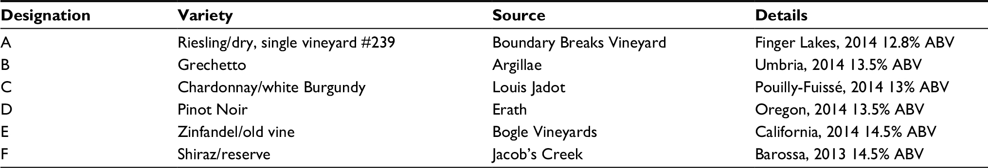 | Table 1 The wines used in the measurements and analyses Notes: Wines A–C are whites, approximately increasing in body, while wines D–F are reds, approximately increasing in body and pigmentation. All wines were purchased commercially in Rochester, NY, USA. All measurements were made in August 2016. The goal was to simply evaluate a variety of wines since the specific wines have little impact on the results. Abbreviation: ABV, alcohol by volume. |
The wines selected for this work are not critical and the main goal was to include variety while keeping the data volume and analyses manageable. In most cases, analyses focus on the changes in color appearance of one wine with changes in illumination, but there are a few cases where the change of illumination can make one varietal look like another.
Spectrophotometric measurements
The first set of measurements can be characterized as traditional visible transmittance spectrophotometry using a Macbeth ColorEye 7000 spectrophotometer in transmittance mode. Measurements were made from 360 to 750 nm in 10 nm increments and reported as percent transmittance relative to air (i.e., the percentage of light of a given wavelength passing straight through the sample and cuvette). These were external regular transmittance measurements that included the path length of the wine sample and the liquid cells (cuvettes). The cell walls were retained in the measurements to avoid difficulties of index matching at the wine–cell interfaces and to most closely resemble measurements of wine in a glass. The cuvettes used included wine transmittance path lengths of 5, 10, 20, and 40 mm to allow comparisons of various wine path lengths with in-glass measurements. The cuvettes were 25 mm2 (normal to the light path) and designated as Optical Crystal Cell Type 60 “G”.
The raw measurements were truncated and interpolated 380–750 nm with 5 nm increments to facilitate consistent data reporting and computational analyses for measurements from various instruments. Data were recorded as percent transmittance (0%–100%) with instrument repeatability of ~0.001%. Such precision eliminates the need for repeat measurements on the sample and translates into colorimetric precision far better than the human visible threshold. Each measurement took under a minute to complete such that an entire set for a single wine would take well under 10 minutes (including time to fill cuvettes). These measurements were completed immediately after the in-glass measurements (and photographs) described below were completed.
In situ measurements
The second set of measurements, referred to as in situ measurements, were a set of 4 different spectroradiometric measurements made of wine samples in International Organization for Standardization (ISO) taster glasses under simulated daylight illumination in a standard viewing booth. Each sample was precisely 60 mL and poured in a clean ISO taster glass. The viewing booth was a GTI CMB-3064 viewing booth with fluorescent daylight (D65) simulators as the selected illumination. A rig was constructed to securely hold the glass at an angle of 45°. A white standard reference plaque (near perfect white) was placed directly under the bowl of the glass to allow the wine to be viewed from above with a white background. A mirror was placed directly above the wine sample (also at 45°) to allow a spot spectroradiometer (Photo Research PR655) in the laboratory to effectively view the wine sample from above. The light source directly above the glass was blocked to avoid measurement of reflections of the diffuse white in the wine glass itself. Figure 1 is a photograph of the experimental setup with a sample glass and the spectroradiometer in place. The spectraradiometer measured the absolute spectral radiance (amount of light) coming from the wine glass in a given position. In addition, the spectral radiance of the white standard reference was measured with no wine glass in place. Percent spectral transmittance of the wine (and the glass) was computed by dividing the measurements of the wine sample by the measurements of the white reference (and multiplying by 100). This computation, like that done internally in the spectrophotometer, removes any influence of the light source used in the measurements. Those influences can then be examined computationally in the colorimetric analyses for various illuminants. Data were recorded from 380 to 780 nm in 4 nm increments and then resampled/truncated to 380–750 nm with 5 nm increments for analyses and computations. Again, all data were recorded as percent transmittance (0%–100%). This instrument, since it does not directly measure energy ratios, is not as precise as the spectrophotometer. Worst case repeatability for these measurements is on the order of 0.5%. This is still well below visible thresholds and significantly less than any effects discussed in this paper.
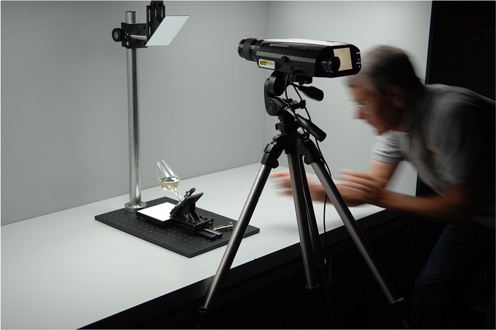 | Figure 1 Experimental setup for measurement of wine transmittance in situ within a D65 standard viewing booth. Notes: A standard ISO taster is tilted to 45° and measured from above (through mirror) with a spectroradiometer. The scientist making the measurement has provided written consent for this image to be published. Abbreviation: ISO, International Organization for Standardization. |
A camera can also be placed in the location of the spectroradiometer in this setup to take photographs accurately representing the illumination and measurement geometry of the wine measurements. Such photographs, for each of the 6 wines, are given in Figure 2 along with a normal side-on image of all 6 together. In addition, the Riesling (Wine A) image is labelled with 3 black letters to indicate the 3 measurement locations for which data were collected. The locations are the edge of the wine (E), a location about one-quarter the way across the wine surface (Q), and a location as near to the center of the surface as possible (C) without interference from the top surface of the glass. These locations simulate how a taster might evaluate near the edges of the wine (short path lengths) compared with the middle (long path length) of the sample.
 | Figure 2 The middle panel shows the 6 wines measured in order from (A–F) as viewed from the side in the D65 viewing booth. Notes: The top and bottom panels show each wine as viewed through the measurement apparatus in Figure 1 (camera replaces spectroradiometer). The labels E, Q, and C on wine A show the 3 locations measured. |
Finally, the glass was placed normally in the bottom of the viewing booth and measurements made from the side of the glass in the center of the sample. These measurements are referred to as “straight” to suggest viewing the glass straight on and are similar to the center measurements made by Huertas et al.7 However, the background in these measurements was the gray booth wall, perhaps a good simulation of a real viewing environment, and transmittance was computed relative to the white reference measurement described above. It is therefore likely that the present measurements suggest the wine to be slightly darker than the prior measurements.7 The important point in this work is that these measurements clearly illustrate the importance of controlling illumination and viewing geometry when making color measurements or sensory evaluations of wine.
Analyses
The first step in analyses of the raw collected data was pre-processing all the measurements into spectral percent transmittance functions in the wavelength range of 380–750 nm with 5 nm increments. This was completed for each wine sample and each of the 8 measurement geometries (5, 10, 20, and 40 mm cuvettes, and edge, one-quarter, center, and straight in the glass). These are the fundamental data for colorimetric computations and analyses.
Colorimetric computations require selection of a standard colorimetric observer and illuminants. For all computations reported in this research, the CIE 1964 Standard Colorimetric Observer, also known as the 10° observer, was used to compute CIE XYZ tristimulus values and other colorimetric parameters derived from them. The standard observer functions, known as color matching functions, were also truncated to the 380–750 nm range and used in their published 5 nm increment form.
Light sources are represented by standardized spectral power distributions that can be used in a uniform way to explore color tolerances and appearance. Five illuminants were used to explore the effects of various types of illumination on apparent wine color. These are listed in Table 2 along with some descriptive data. The first represents a standardized incandescent lamp, CIE Illuminant A, with a correlated color temperature (CCT) of 2856K, a CIE color rendering index (CRI) of 100 as one of the reference points for that metric, and Illumination Engineering Society TM-30 color fidelity index (Rf) of 100 and color gamut index (Rg) of 100. Metrics for the other illuminants can be found in Table 2. The illuminants also include CIE illuminant D65 (representing an average overcast daylight), CIE illuminant F11 (representing typical tri-band office/commercial fluorescent lighting), and 2 modern LED illumination systems, both with 4000K CCTs (like F11) but with very different spectral characteristics. One is a common blue-pumped LED (blue LED pumping a yellow phosphor to produce white) and the second is a more high color quality RGBA LED made up of red, green, blue, and amber LEDs to produce white. The first 3 illuminants allow the exploration of different types and colors of illumination while the last 3 allow the examination of lighting with different properties (such as color rendering) while all being nearly the same color (a slightly warm, or yellowish, white).
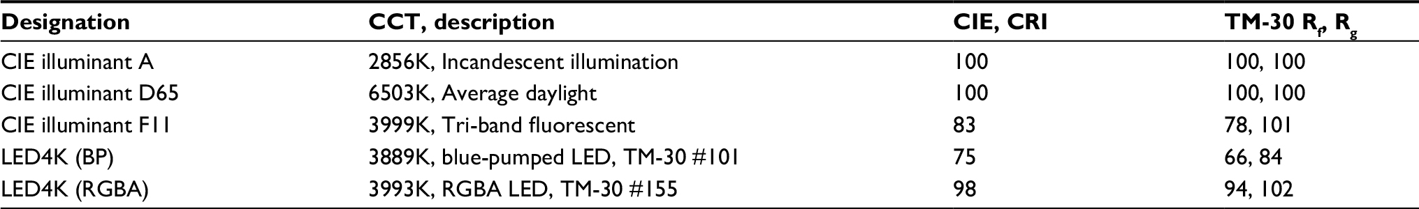 | Table 2 Illuminants and sources used for colorimetric analyses Notes: Included are their names, CCTs, descriptions, CIE CRI, and IES TM-30 color Rf, Rg. Abbreviations: CCT, correlated color temperature; CIE, Commission Internationale de l’Eclairage; CRI, color rendering index; IES, Illumination Engineering Society; LED, light-emitting diode; Rf, fidelity index; Rg, gamut index. |
Two color spaces were selected for evaluation of the data, CIELAB and CIECAM02. CIELAB is a color space recommended by the CIE in 1976 for the evaluation of color tolerances and small color differences. As input, it takes the CIE tristimulus values (essentially amount of light absorbed by the 3 cone types in the eye) for the sample and for the light source (to account for our adaptation to the lighting) and computes parameters that describe the lightness (L*), hue (hab), chroma (C*), redness–greenness (a*), and yellowness–blueness (b*). Relative color appearance can be described using 2 sets of parameters that can be derived from one another, either L*habC* or L*a*b*. In this paper, a derivative metric, which correlates with perceived saturation is used. This saturation metric (S) is simply the chroma divided by lightness (C*/L*).5 Thus, the lightness–hue–saturation of the wine samples (L*habS) are the CIELAB parameters of interest.
CIECAM02 was established by the CIE in 2002 as a more sophisticated space for the description of color appearance.5 In addition to the tristimulus information for the sample and illuminant required by CIELAB, CIECAM02 also requires the absolute luminance of the lighting (amount of light) and parameters about the background, surround, and degree of adaptation. CIECAM02 is used in this paper to explore the effects of amount of light (luminance) on wine appearance. Output appearance correlates from CIECAM02 include lightness (J), brightness (Q), hue (h), hue quadrature (H), chroma (C), colorfulness (M), and saturation (s). In this paper, the focus is on lightness, hue, saturation and hue quadrature (JhsH) with their importance described more fully in the results in discussion below. All CIECAM02 computations in this research were done assuming an average gray background/surround such that the only variables considered were the illumination color and level.
The uncertainty in the spectrophotometric measurements of 0.001% for the cuvette measurements and 0.5% for the in-glass measurements translates into colorimetric uncertainties that are approximately the same percentage of the reported values. In other words, a CIELAB L* value of 50 can be considered precisely to ~0.0005 (cuvettes) or 0.25 (glasses). The same goes for other metrics. All the measurements are far more precise than necessary for the conclusions drawn in this paper. A visual threshold varies substantially with color and viewing condition but can reasonably be considered no better than 1%–2% of the colorimetric values. No psychophysical experiments on visual assessment of wine color were completed in this work. However, the results described are such significant changes in color that they are easily observed. For example, examination of any red wine, in glass, with lighting varying in CCT from 3000 to 6500K will exhibit clear hue changes. The objective of this research was to analytically and computationally quantify such effects.
All the spectral transmittance data and colorimetric parameters described above for each wine have been compiled into a single spreadsheet file that is publicly available for further analyses. It is posted on the author’s website at <www.rit-mcsl.org/fairchild/files/MDF_WineData.xlsx>.
Results and discussion
Spectral analysis of geometry
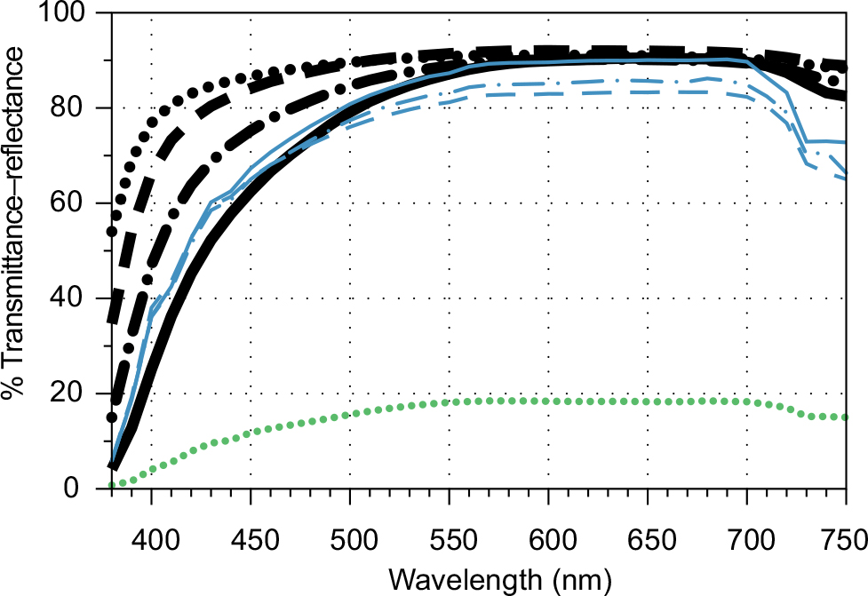
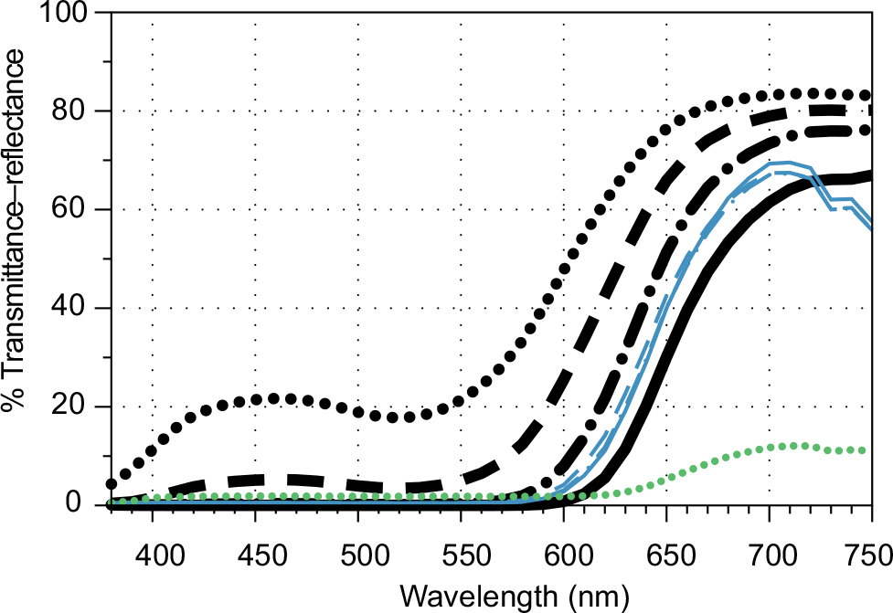
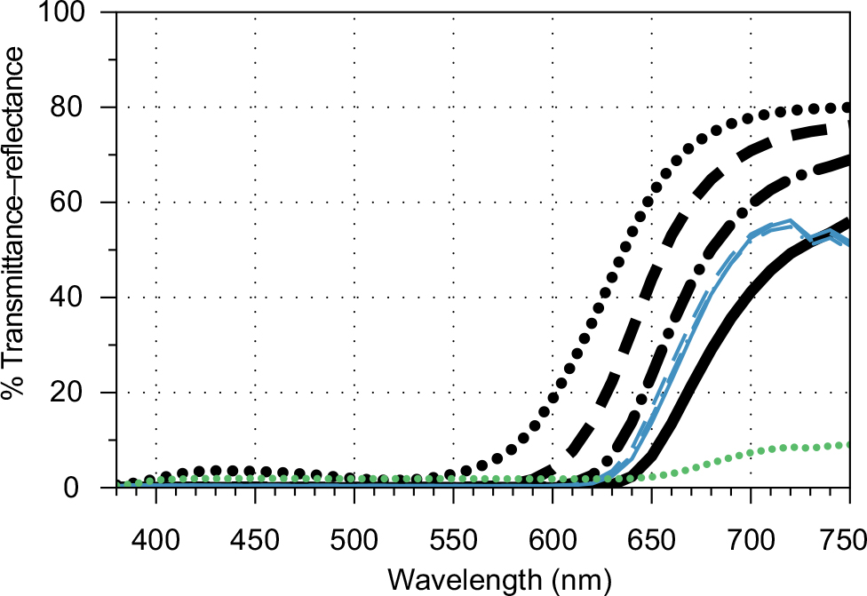
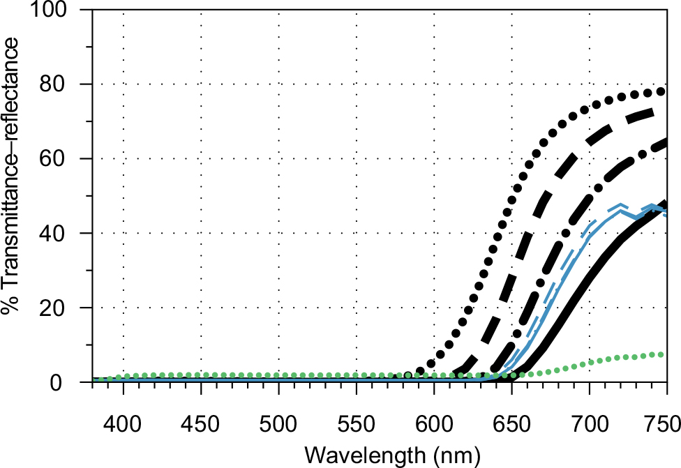
Figures 3–8 include all the spectral transmittance data for each of the 6 wines and 8 measurement geometries. The thick black lines are for the cuvette measurements, with the shortest path length (5 mm) represented by the dotted line and the longest (40 mm) represented by the solid line, which is always lower in transmittance. The thin blue lines represent the in-glass measurements with the solid line at the edge (E), the dot–dashed line at the quarter position (Q), and the dashed line at the center position (C), are also at a lower transmittance than the others. The lowest curve of all is for the straight-on (straight) measurement to the side of the glass with the gray background, and is represented by a green dotted line.
 | Figure 3 Spectral transmittance plots for wine (A), Riesling. Thick black lines are for cuvettes increasing in thickness from 5 to 40 mm (solid line). Notes: Thin blue lines are for in-glass measurements from the edge (solid line) to center (dashed line). Green dotted line is for measurements straight on to the side of the glass. |
 | Figure 4 Spectral transmittance plots for wine (B), Grechetto. Notes: Thick black lines are for cuvettes increasing in thickness from 5 to 40 mm (solid line). Thin blue lines are for in-glass measurements from the edge (solid line) to center (dashed line). Green dotted line is for measurements straight on to the side of the glass. |
 | Figure 5 Spectral transmittance plots for wine (C), Chardonnay. Thick black lines are for cuvettes increasing in thickness from 5 to 40 mm (solid line). Notes: Thin blue lines are for in-glass measurements from the edge (solid line) to center (dashed line). Green dotted line is for measurements straight on to the side of the glass. |
 | Figure 6 Spectral transmittance plots for wine (D), Pinot Noir. Notes: Thick black lines are for cuvettes increasing in thickness from 5 to 40 mm (solid line). Thin blue lines are for in-glass measurements from the edge (solid line) to center (dashed line). Green dotted line is for measurements straight on to the side of the glass. |
 | Figure 7 Spectral transmittance plots for wine (E), Zinfandel. Notes: Thick black lines are for cuvettes increasing in thickness from 5 to 40 mm (solid line). Thin blue lines are for in-glass measurements from the edge (solid line) to center (dashed line). Green dotted line is for measurements straight on to the side of the glass. |
 | Figure 8 Spectral transmittance plots for wine (F), Shiraz. Notes: Thick black lines are for cuvettes increasing in thickness from 5 to 40 mm (solid line). Thin blue lines are for in-glass measurements from the edge (solid line) to center (dashed line). Green dotted line is for measurements straight on to the side of the glass. |
The white wines (Figures 3–5) are readily distinguished from the reds (Figures 6–8). The white wines transmit essentially all wavelengths of light to a high degree (around 80%), but then absorb strongly in the short wavelength end of the spectrum. Thus, they are absorbing bluish light while transmitting other wavelengths resulting in their typical yellowish color. As path length increases, the wines absorb more light, perceptually becoming darker and more saturated. This is true for both the cuvettes and the tasters. Lastly, the straight-on measurement shows a much lower transmittance. In the whites, this is due to 2 factors, the increased path length through the wine and the gray, rather than white background. As one moves from the extremely light Wine A – Riesling to the more dense and saturated Wine C – Chardonnay, the increase in absorbed light across the wavelengths, and most strongly in the short wavelengths, is evident.
In comparing the red wines to the white wines, one can immediately see that the red wines absorb strongly throughout the visible spectrum with the exception of the longer wavelengths where transmittance gets up to near 80% in some cases. This is characteristic of reddish materials, to absorb bluish (short) and greenish (middle) wavelengths while transmitting or reflecting the reddish (long) wavelengths. Again, the wines absorb more light and become more saturated as path length increases (more so seen in the cuvettes than the tasters). The sensitivity to path length in the tasters is decreased because the density of the wines is so high and the measurements are more impacted by surface reflectance from the glass than absorption by the wine. This is also seen in the straight-on measurements that are defined almost entirely by path length and show little sensitivity to the background behind the glass. Visual observation of many red wines in the glass, and from the side, confirms that the apparent color is essentially black and highlights why color judgments must be made near the meniscus on tilted glasses. Regarding the varietals, one can observe the clear, bright nature of Wine D – Pinot Noir in its relatively high transmittance of light throughout the spectrum and see that progress to the dark, deep reds of Wine – F Shiraz, which only transmits light at all at the extreme red end of the spectrum. These progressions of color in both white and red wines are more appropriately, and easily, observed in the colorimetric values, which are designed to correlate with human perception.
Ideally, the spectral transmittance curve shapes would be identical for the cuvette and taster measurements. (Technically that would be true on logarithmic plots, but the differences are significant enough to observe on the more intuitive linear plots.) The changes in shape are attributed to the unavoidable surface-and inter-reflections of the curved taster glass surfaces (as well as the top surface of the wine interface with the air). These serve to reduce the measured colorimetric saturation of the wine, relative to the cuvette measurements, and to relatively reduce the effects of path length through the wine. Since careful sensory evaluation of wine color is often made near the edge (near the meniscus) in a tilted glass to allow discrimination of small differences in wine colors, it was desired to examine most of the colorimetric values for a cuvette thickness that produced measurements most similar to the taster edge (E) measurements. Cuvette measurements were most desired since they are most stable, precise, and repeatable. Examination of the spectral transmittance data and the colorimetric data (L* in particular) suggested that the 40 mm cuvette measurements were probably best for the white wines and the 20 mm cuvette measurements were best for the red wines. The true optimal result was probably around 30 mm path length, but such measurements were not available. The 20 mm cuvette measurements were selected for further analysis to err on the side of lighter than the taster edge measurements since it is likely that human assessments would be done a little closer to the edge of the sample. Thus, where path length is not a variable in the colorimetric analyses below, the 20 mm path length is used. Results for the other path lengths and in taster measurements are available in the online spreadsheet.
Color analysis of geometry (CIELAB)
Figures 9–11 show the CIELAB parameters for illuminant D65 and the 10° observer (lightness [L*], hue angle [hab], and saturation [S=C*/L*]) for each of the 6 wines and 8 measurement geometries. These plots confirm the observations of the spectral transmittance data and express it in color appearance correlates. The 4 data points to the left are from cuvette measurements of different path lengths while the 4 data points to the right are for the various ISO taster glass measurements in the viewing booth.
 | Figure 9 CIELAB lightness (L*) for all 6 wines and the 8 distinct measurement geometries. Notes: White wines (grouped together) are plotted in tan lines while the red wines are plotted with burgundy lines (D–F, from lightest to darkest). Abbreviations: CIELAB, Commission Internationale de l’Eclairage L*a*b*; ISO, International Organization for Standardization. |
 | Figure 10 CIELAB hue angle (hab) for all 6 wines and the 8 distinct measurement geometries. Notes: White wines are plotted in tan lines (grouped together) while the red wines are plotted with burgundy lines (D–F from top to bottom where separated). Abbreviations: CIELAB, Commission Internationale de l’Eclairage L*a*b*; ISO, International Organization for Standardization. |
 | Figure 11 CIELAB saturation (s=C*/L*) for all 6 wines and the 8 distinct measurement geometries. Notes: White wines are plotted in tan lines (grouped together) while the red wines are plotted with burgundy lines (D–F from bottom to top). Abbreviations: C*, chroma; CIELAB, Commission Internationale de l’Eclairage L*a*b*; ISO, International Organization for Standardization; L*, lightness. |
Figure 9 shows the lightness (L*) results. The 3 white wines (tan lines) have virtually the same lightness and show similar changes with geometry (darkening with path length and most dark in the straight side measurement). The red wines (burgundy lines) show similar trends except with more variation due to their greater density. All get darker with path length for the cuvette measurements, with Wine D – Pinot Noir having the highest lightness and Wine F – Shiraz the lowest. The in-glass measurements show little effect of path length since the glass reflection is controlling the lightness and the straight to the side measurements are all similar since they have very high path length (these are essentially measurements of the glass with black liquid in them). One can also observe that the in-glass edge (E) measurements align, in lightness, with the cuvette measurements for path lengths between 20 and 40 mm.
Figure 10 is similar for hue angle (hab). A hue angle of about 90° is a typical yellow while about 25° is a typical red. Geometry has little effect on the measured hue of the white wines. More seemingly random results are observed with the red wines. Hue shifts in dense color samples with changes in concentration or path length are not unusual due to nonlinear relationships between spectra absorption and human perception. These are seen in the cuvette measurements where Wine D – Pinot Noir shifts to a more yellowish-red hue with increased path length while the other 2 red wines shift to a more purplish-red. This is consistent with observations by human sensory evaluators who can witness a variety of hues when viewing near the meniscus of red wine.
Figure 11 shows saturation (s=C*/L*) for the wines. Note results for all the wines are essentially zero saturation for the straight side measurements. For the red wines, this is because the samples are essentially black in that geometry. For the white wines, it is because they are nearing white (clear) due to being dominated by surface reflections from the taster glasses. In the cuvettes, the wines increase in saturation with path length. The white wines are all similar and at very low saturation levels (pale). The red wines climb in saturation quickly and Wine F – Shiraz even saturates in saturation after a 20 mm thickness (more thickness does not make the wine more colorful). The differences between the 3 reds are very clear. The ordinal relationships hold in the taster glass measurements, but the lower measured saturations are again due to glass surface reflections.
Color appearance analysis of geometry (CIECAM02)
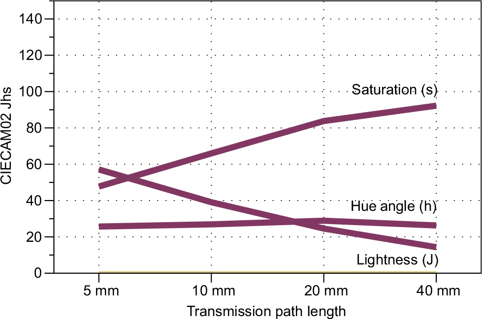
A closer look at geometry influences examines the CIECAM02 color appearance correlates for just 2 of the wines, Wine A – Riesling and Wine D – Pinot Noir, and only the cuvette measurements. All CIECAM02 correlates were computed with illuminant D65, the 10° observer, a 100 cd/m2 white luminance (similar to home or office light levels), complete adaptation, and average surround/background.
Figures 12–13 are for Wine A – Riesling. Lightness (J), hue angle (h), and saturation (s) are plotted on a single set of axes in Figure 12. As path length increases, the wine becomes slightly darker, shifts in hue from a slightly greenish- yellow toward pure yellow, and becomes significantly more saturated. Figure 13 is a more detailed visualization of hue composition (H), which is derived directly from hue angle (h). Hue composition describes hue in terms of percentages of the 4 unique hues, red, yellow, green, and blue. A unique yellow is one in which there is no perceived green or red content while a unique red is one in which there is no perceived yellow or blue content and so on. There can be no more than 2 of the components present in any single stimulus. For Wine A – Riesling, the hue is dominated by yellow with a minor secondary component of green, a slightly greenish-yellow. For the 5 mm path length, the proportion is about 70% yellow and 30% green, and it grows to about 95% yellow and 5% green with a 40 mm path length. Clearly, apparent hue is strongly dependent on path length, even for a single illuminant. Its name in a wine sensory evaluation might vary significantly with choice of viewing depth and illuminant.
 | Figure 12 CIECAM02 color appearance correlates of lightness (J), hue angle (h), and saturation (s) for Wine A – Riesling across the 4 different cuvette path lengths. Notes: Values reported are for CIE illuminant D65 at a luminance level of 100 cd/m2. Abbreviation: CIECAM02, Commission Internationale de l’Eclairage Color Appearance Model 02. on. |
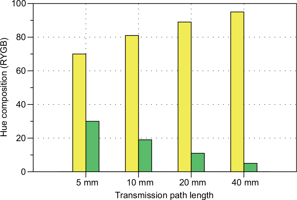 | Figure 13 Bar chart representation of the CIECAM02 hue composition (percent yellow and percent green appearance in the hue in this case) across different path lengths for Wine A – Riesling under D65 at 100 cd/m2. Abbreviations: CIECAM02, Commission Internationale de l’Eclairage Color Appearance Model; RYGB, red-yellow-green-blue. |
Figures 14 and 15 are similar plots for Wine D – Pinot Noir. This wine is much darker than the white and decreases in lightness substantially with path length. It is effectively black for the 40 mm path length. For this particular wine, hue is relatively stable across path length. This is might be due to the relative darkness/density of the red wines. Finally, saturation climbs significantly from about 45 for the 5 mm path length to about 70 for the 40 mm path length. The hue composition bar chart in Figure 15 shows this wine to be a slightly (~5%) yellowish red (~95%) with a very slight decrease in redness across the first 3 path lengths that reverse for the deepest cuvette. This wine is essentially unique red with a just perceptible tinge of yellow and would probably be evaluated as “ruby” in a sensory evaluation (under this light source) with perhaps the slightest tinge toward “garnet”.
 | Figure 14 CIECAM02 color appearance correlates of lightness (J), hue angle (h), and saturation (s) for Wine D – Pinot Noir across the 4 different cuvette path lengths. Notes: Values reported are for CIE illuminant D65 at a luminance level of 100 cd/m2. Abbreviations: CIECAM02, Commission Internationale de l’Eclairage Color Appearance Model 02. |
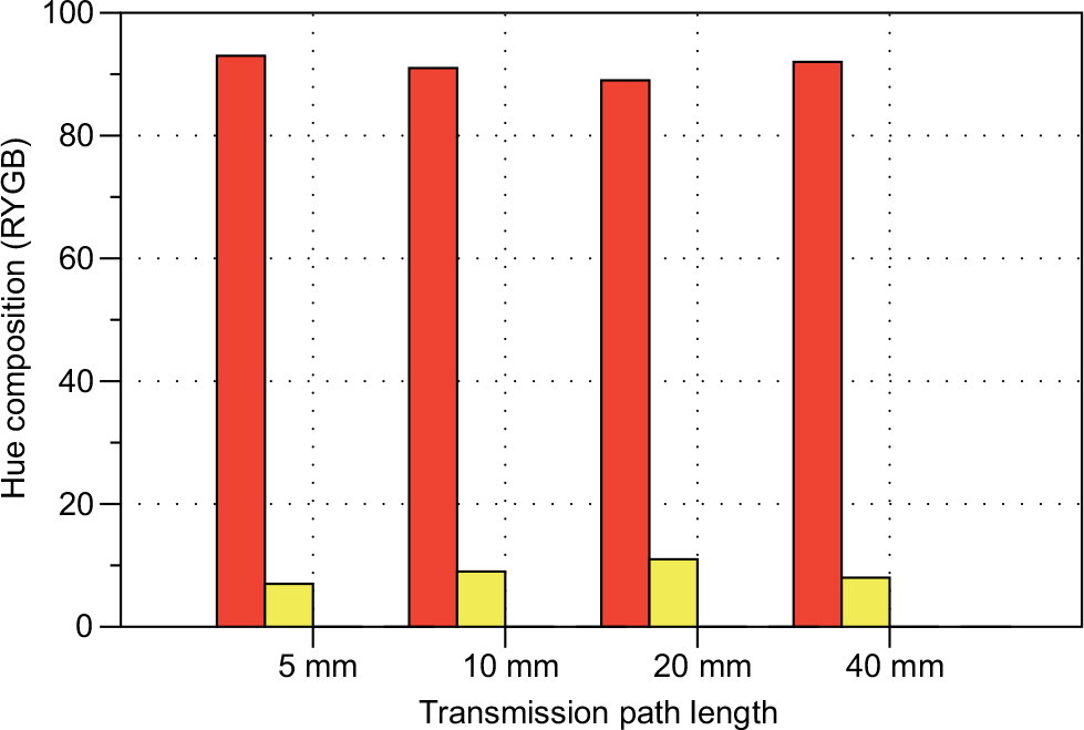 | Figure 15 Bar chart representation of the CIECAM02 hue composition (percent red and percent yellow appearance in the hue in this case) across different path lengths for Wine D – Pinot Noir under D65 at 100 cd/m2 Abbreviations: CIECAM02, Commission Internationale de l’Eclairage Color Appearance Model; RYGB, red-yellow-green-blue. |
Effects of luminance on color appearance
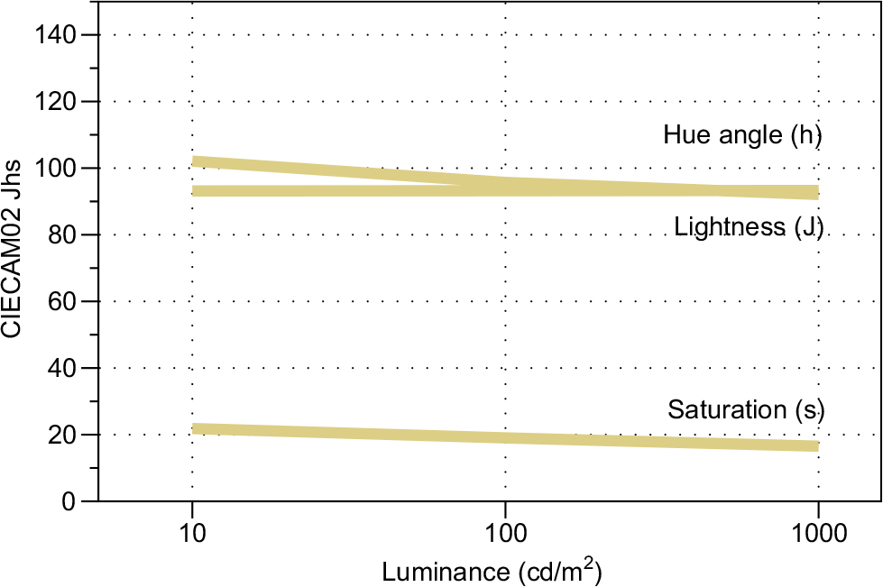
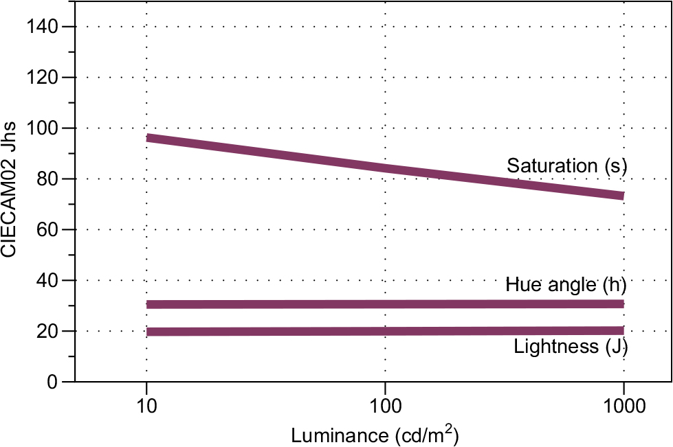
For the same 2 wines, one can use CIECAM02 to examine the effects of luminance level (amount of light) on the color appearance attributes of wine. In this case, only the 20 mm path length is examined and only CIE illuminant D65 is used. Three luminance levels are examined, 10, 100, and 1000 cd/m2. Approximately, these can be considered a dim restaurant or seminar room, a typical office or retail store, and outside under indirect illumination or light overcast, respectively.
Figures 16 and 17 show the appearance correlates for Wine A – Riesling and Wine D – Pinot Noir, respectively. For Wine A – Riesling, the lightness (J) is relatively constant across the change in luminance levels. This wine looks light and pale regardless of the amount of light. The hue (h) changes rather substantially from a slightly greenish-yellow to more nearly a unique yellow at higher luminance levels. It is not clear what causes this shift, but it could be due to changes in the degree of adaptation to this. Finally, saturation (s) decreases with increased luminance level. While, normally, saturation is thought to increase with luminance, the opposite effects is seen for very pale colors such as this wine. Essentially, the observer adapts more to the wine itself (becoming less sensitive to its saturation) as luminance increases. This point illustrates that more light is not always better and that there is almost certainly an optimum middle level of illumination for white wine sensory evaluation.
 | Figure 16 CIECAM02 color appearance correlates of lightness (J), hue angle (h), and saturation (s) for Wine A – Riesling across 3 different luminance levels with a 20 mm cuvette path length. Note: Values reported are for CIE illuminant D65. Abbreviations: CIECAM02, Commission Internationale de l’Eclairage Color Appearance Model 02. |
 | Figure 17 CIECAM02 color appearance correlates of lightness (J), hue angle (h), and saturation (s) for Wine D – Pinot Noir across 3 different luminance levels with a 20 mm cuvette path length. Note: Values reported are for CIE illuminant D65. Abbreviations: CIECAM02, Commission Internationale de l’Eclairage Color Appearance Model 02. |
Figure 17 shows the same results for Wine D – Pinot Noir. Lightness (J) and hue (h) are almost perfectly constant for these changes in luminance level. This is a surprising result and is likely due to the specific hue and lightness of the wine. Without attributing this to some sort of mystical intervention, it is impressive that a drink that holds such a unique place in human society also happens to occupy a unique spot in color appearance space. Saturation (s), however, shows a more unusual variation with luminance. Typically, increases in both chroma and lightness with luminance level offset and create approximately constant saturation. Instead, there is a constant lightness, along with a decrease in chroma (not shown) that results in the decrease in saturation (shown). Regardless, this does illustrate that Wine D – Pinot Noir indeed changes appearance with luminance level and becomes less saturated, essentially less “radiant” relative to the background, at higher luminance levels and that critical sensory evaluation should pay attention to the luminance level.
Effects of lighting type on color appearance
To the main motivational question of this research; is wine color appearance sensitive to the color/type of illumination? Figures 18–20 show the CIECAM02 lightness (J), hue angle (h), and saturation (s) for all 6 wines. All computations are for the 20 mm cuvette at 100 cd/m2. This paper started with a quote asserting that “any bright, white light source is probably acceptable”.16 If that were the case, then Figures 18–20 would have nothing but straight horizontal lines for each wine and all appearance dimensions. That is not the case. Figure 18 illustrates that lightness is relatively constant across the illuminants for the white wines but varies greatly for the red wines. Specifically, the illuminants with less long wavelength content, although appearing bright and white, will make the red wines appear significantly darker. The changes in hue shown in Figure 19 are even more significant and perhaps more important since hue perception often leads to color names. The white wines appear reddish-yellow under incandescent lighting (common in restaurants and homes), then significantly greenish-yellow under daylight (the recommended lighting, almost never used) and progress back to more of a yellowish color under the other lights. The reds are not so systematic. The crossover in these plots shows that one varietal under one illumination can be easily confused for another varietal under another illumination. Thus, students learning wine color appearance under one type of illumination will make mistakes when evaluating wine under other types of illumination. Saturation, illustrated in Figure 20, also has significant dependency on the illuminant. The fluorescent (sometimes recommended) and blue-pumped LED significantly desaturate the red wines (they look less red) compared with the standard incandescent (A), daylight (D65), or the high-quality RGBA LED. The white wines are less impacted due to their paleness, but they are also significantly influenced by lighting type.
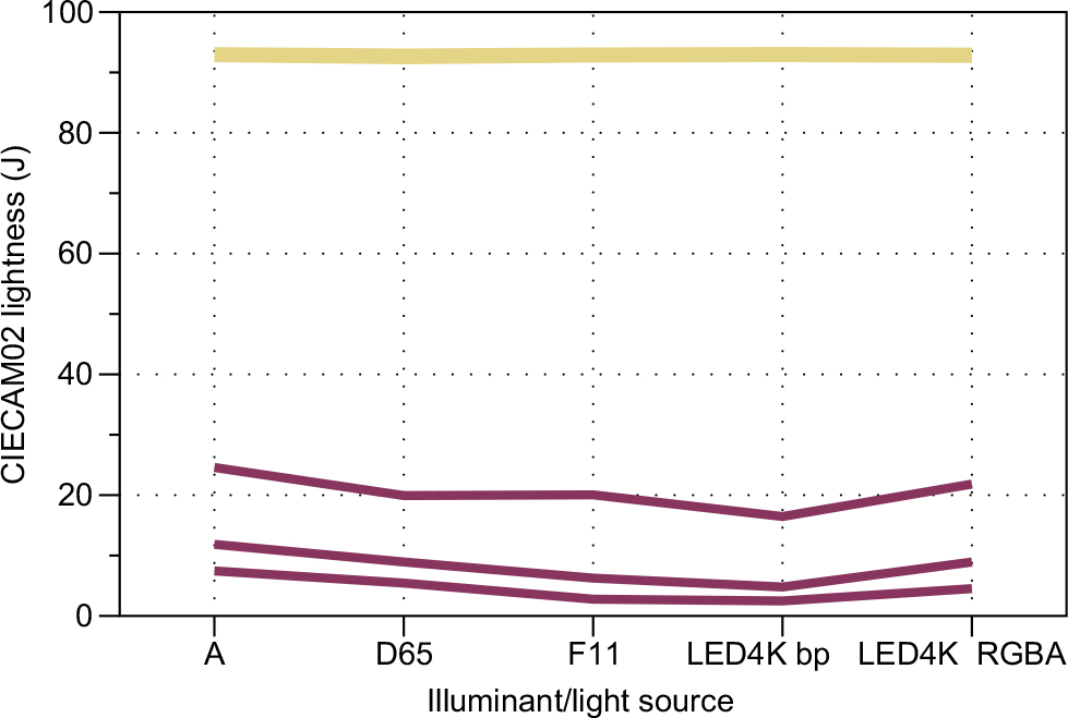 | Figure 18 CIECAM02 lightness (J) for all 6 wines at 100 cd/m2 with a 20 mm path length and all 5 illuminants. Notes: White wines are plotted in tan lines (grouped together) while the red wines are plotted with burgundy lines (D–F from top to bottom). Abbreviations: CIECAM02, Commission Internationale de l’Eclairage Color Appearance Model 02; LED, light-emitting diode; RYGB, red-yellow-green-blue. |
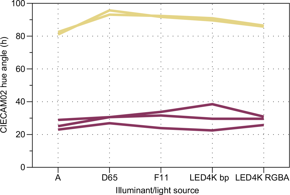 | Figure 19 CIECAM02 hue angle (h) for all 6 wines at 100 cd/m2 with a 20 mm path length and all 5 illuminants. Notes: White wines are plotted in tan lines (grouped together) while the red wines are plotted with burgundy lines (D–F from top to bottom). Abbreviations: CIECAM02, Commission Internationale de l’Eclairage Color Appearance Model 02; LED, light-emitting diode; RYGB, red-yellow-green-blue. |
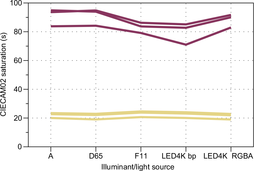 | Figure 20 CIECAM02 saturation (s) for all 6 wines at 100 cd/m2 with a 20 mm path length and all 5 illuminants. Notes: White wines are plotted in tan lines (grouped together with A lower) while the red wines are plotted with burgundy lines (D–F from bottom to top). Abbreviations: CIECAM02, Commission Internationale de l’Eclairage Color Appearance Model 02; LED, light-emitting diode; RYGB, red-yellow-green-blue. |
Hue is critically important in considering wine since it is the dimension that leads to names like purple (bluish-red), ruby (red), and garnet (yellowish-red). Thus, the hue composition bar charts for each of the 6 wines under each of the 5 tested illuminants are given in Figures 21–26. For Wine A – Riesling, the hue changes from a significantly reddish-yellow to a greenish-yellow of nearly equal magnitude depending on the illuminant. It appears that this pale wine has a slight tendency to take on the hue of the light source. Wine B – Grechetto shows similar results with the exception that it is slightly greenish under the blue-pumped LED. And, Wine C – Chardonnay shows results similar to Wine B – Grechetto. The red wines all appear slightly yellowish-red in these conditions, with Wine F – Shiraz showing the lowest yellow content. It never crossed over into purplish in these viewing conditions, but it appears it would in a low luminance incandescent (or candle light) situation. What is important for the red wines is to see how the percentage of yellow content changes significantly with light source types. These ranges are essentially from what would be called a nice “ruby” to a strong “garnet”. Another way to think about it is that changing from daylight to fluorescent F11 or the blue-pumped LED would be a way to simulate the appearance of the wine being nicely aged.
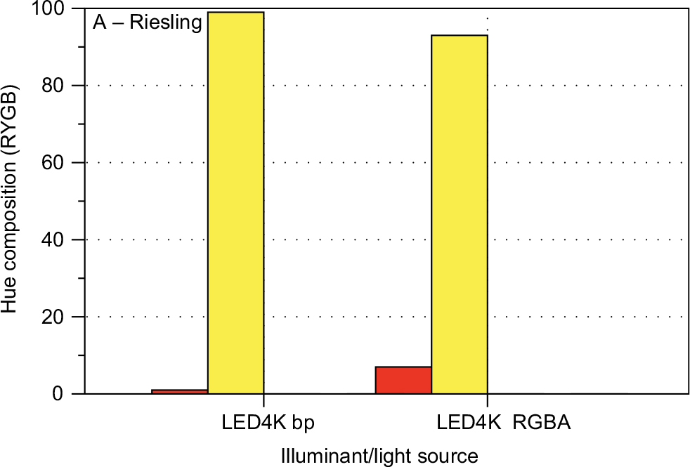
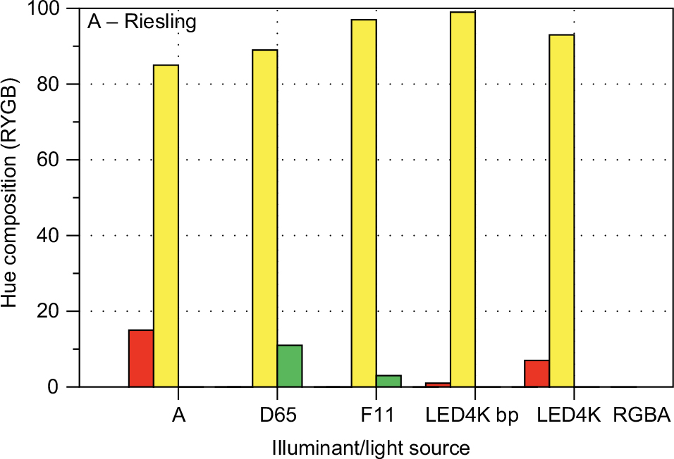 | Figure 21 CIECAM02 hue composition bar charts for Wine A – Riesling for all 5 illuminants. Notes: In this case, hue composition is dominated with the high yellow percentage and small percentages of either green or red, depending on the illuminant. All computations for the 20 mm path length and 100 cd/m2. Abbreviations: CIECAM02, Commission Internationale de l’Eclairage Color Appearance Model 02; LED, light-emitting diode; RYGB, red-yellow-green-blue. |
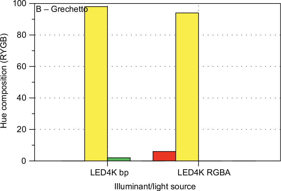
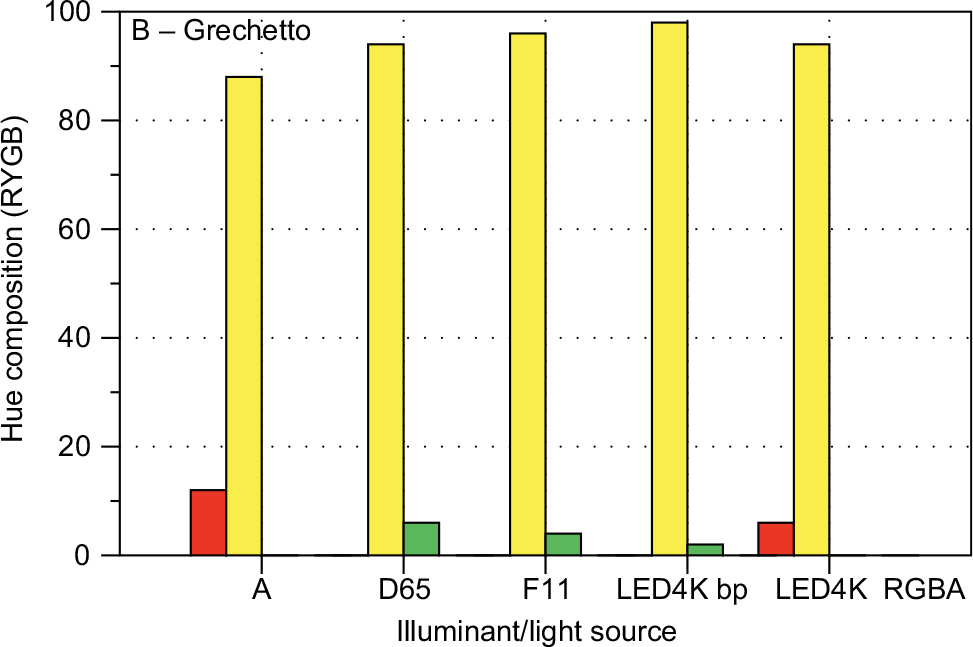 | Figure 22 CIECAM02 hue composition bar charts for Wine B – Grechetto for all 5 illuminants. Notes: In this case, hue composition is dominated with the high yellow percentage and small percentages of either green or red depending on the illuminant. All computations for the 20 mm path length and 100 cd/m2. Abbreviations: CIECAM02, Commission Internationale de l’Eclairage Color Appearance Model 02; LED, light-emitting diode; RYGB, red-yellow-green-blue. |
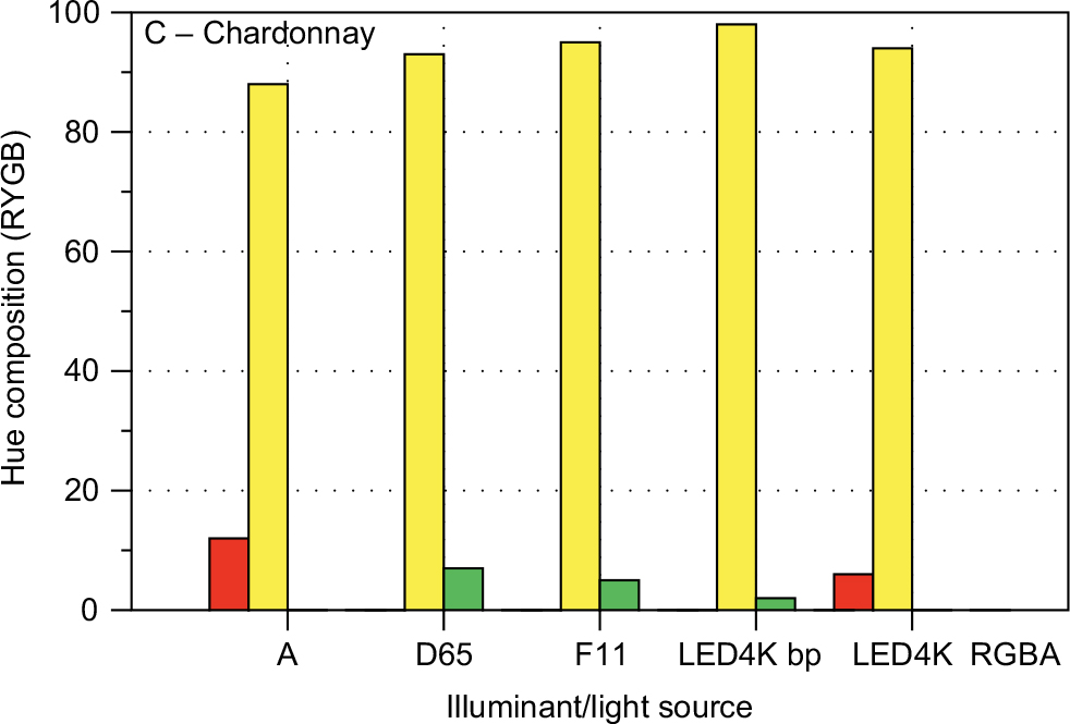 | Figure 23 CIECAM02 hue composition bar charts for Wine C – Chardonnay for all 5 illuminants. Notes: In this case, hue composition is dominated with the high yellow percentage and small percentages of either green or red, depending on the illuminant. All computations for the 20 mm path length and 100 cd/m2. Abbreviations: CIECAM02, Commission Internationale de l’Eclairage Color Appearance Model 02; LED, light-emitting diode; RYGB, red-yellow-green-blue. |
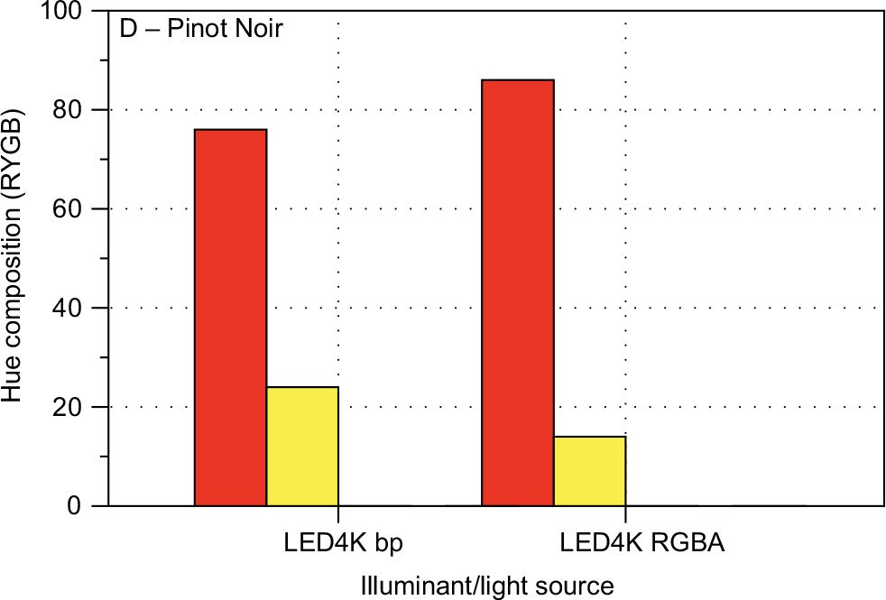
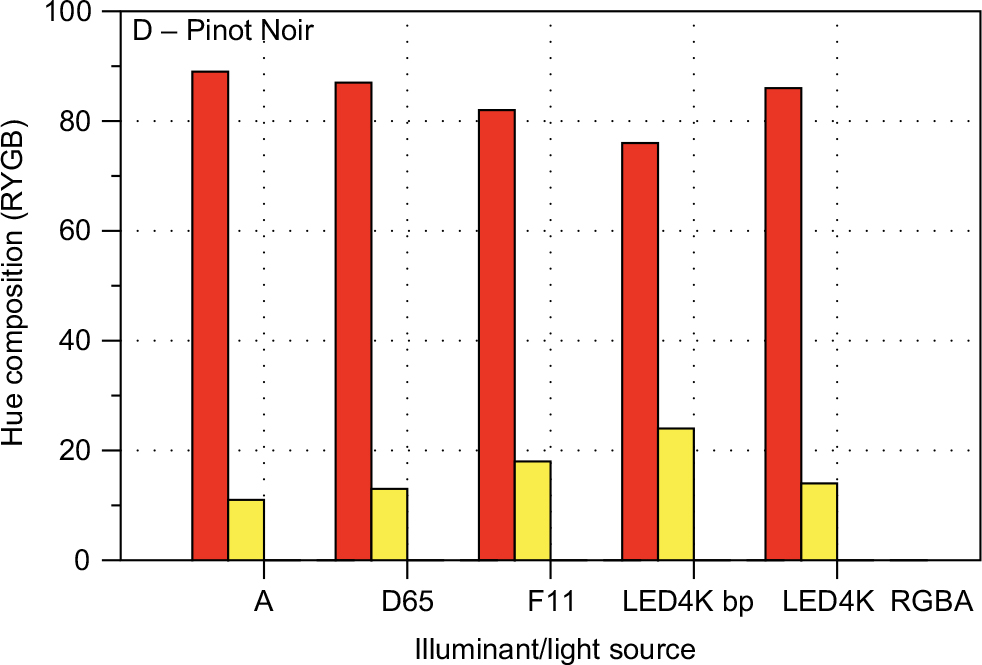 | Figure 24 CIECAM02 hue composition bar charts for Wine D – Pinot Noir for all 5 illuminants. Notes: In this case, hue composition is dominated with the high red percentage and lesser percentages of either yellow, depending on the illuminant. All computations for the 20 mm path length and 100 cd/m2. Abbreviations: CIECAM02, Commission Internationale de l’Eclairage Color Appearance Model 02; LED, light-emitting diode; RYGB, red-yellow-green-blue. |
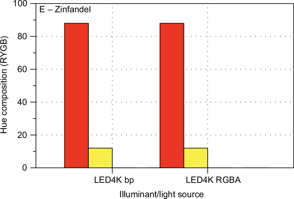
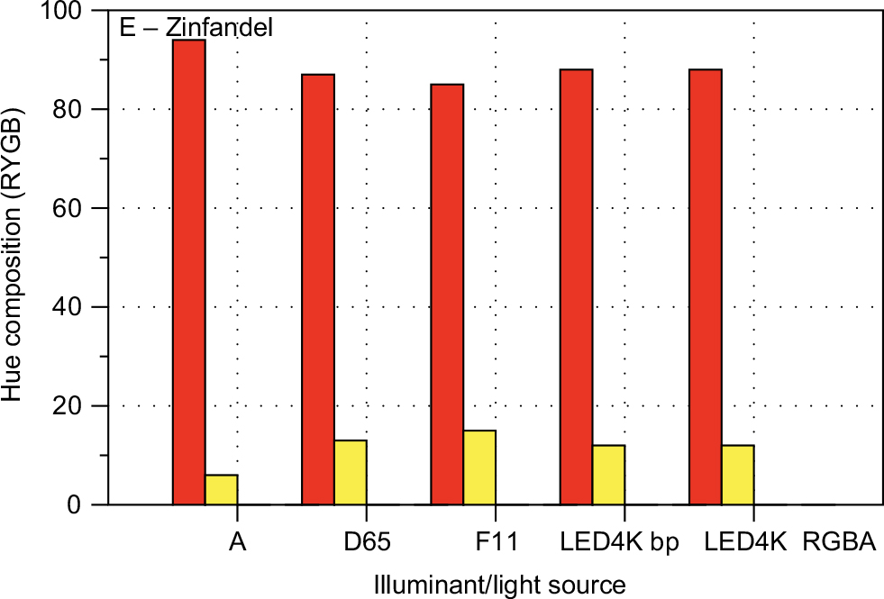 | Figure 25 CIECAM02 hue composition bar charts for Wine E – Zinfandel for all 5 illuminants. Notes: In this case, hue composition is dominated with the high red percentage and lesser percentages of either yellow, depending on the illuminant. All computations for the 20 mm path length and 100 cd/m2. Abbreviations: CIECAM02, Commission Internationale de l’Eclairage Color Appearance Model 02; LED, light-emitting diode; RYGB, red-yellow-green-blue. |
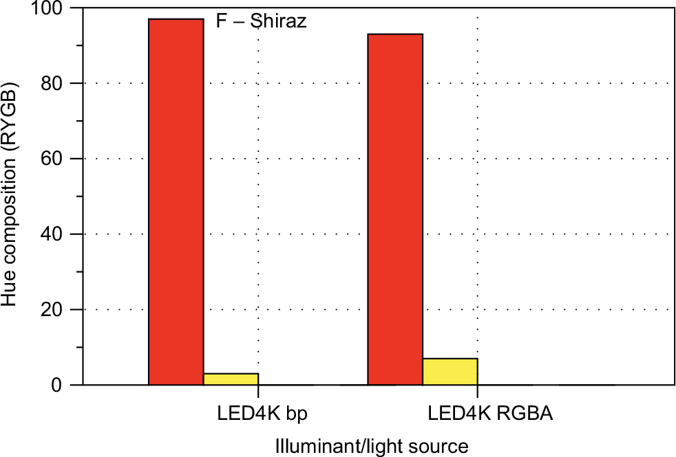
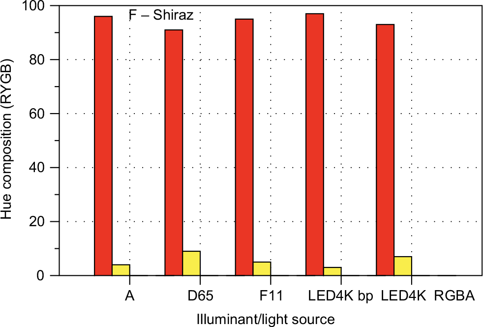 | Figure 26 CIECAM02 hue composition bar charts for Wine F – Shiraz for all five illuminants. Notes: In this case hue composition is dominated with the high red percentage and small percentages of either yellow depending on the illuminant. All computations for the 20 mm path length and 100 cd/m2. Abbreviations: CIECAM02, Commission Internationale de l’Eclairage Color Appearance Model 02; LED, light-emitting diode; RYGB, red-yellow-green-blue. |
CRIs
Another question to examine regarding light sources is the effect of CRI. To examine this, the 2 LED illuminants were selected because they represent modern lighting (residential and commercial) and have the same color (~4000K CCT) but different CRIs (Table 2). The LED4K (BP) is a blue-pumped LED in which a blue LED is used to pump a yellow phosphor to create white light. It has a CRI of 75, which is quite poor, and suggests that it will render the colors of objects under it incorrectly. The LED4K (RGBA) is a RGBA LED that produces white light with a combination of red, green, blue, and amber LEDs and has a CRI of 98, which is good enough to be used in critical color assessment applications. Figures 27–29 show the CIECCAM02 parameters (20 mm cuvette, 100 cd/m2) for all wines and these 2 illuminants. The changes in color witnessed here are not due to changes in the color of the illumination, but are due only to differences in the spectral power distributions of the lighting (i.e., all lights of the same color are not created equal). The whites are relatively constant in lightness while all the reds increase in lightness for the RGBA lamp. Hue angle changes with lamp for most of the wines. The whites shift toward a reddish hue while the reds shift in both directions or stay roughly constant. Finally, the reds are all more saturated with the RGBA lamp due to its increased red content. The whites, on the other hand, show a slight decrease in saturation.
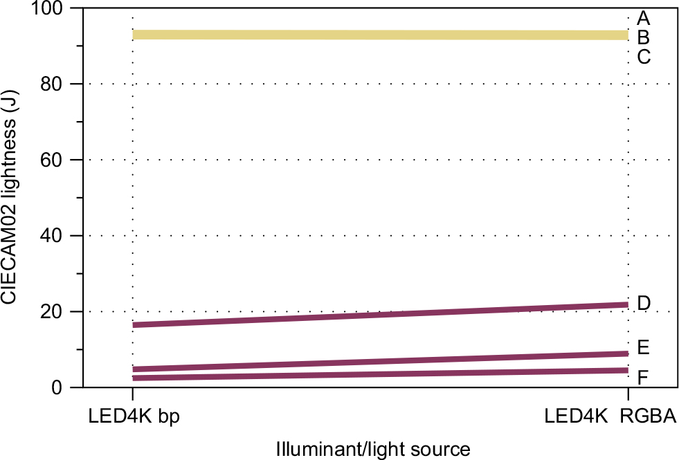 | Figure 27 A more detailed illustration on the effects of color rendering index, or differences in the spectral power distributions, of the 2 LED illuminants with correlated color temperatures of 4000K. Note: CIECAM02 lightness (J) for all 6 wines. All computations at 100 cd/m2. Abbreviations: CIECAM02, Commission Internationale de l’Eclairage Color Appearance Model 02; LED, light-emitting diode. |
 | Figure 28 A more detailed illustration on the effects of color rendering index, or differences in the spectral power distributions, of the 2 LED illuminants with correlated color temperatures of 4000K, but with CIECAM02 hue angle (h). Notes: Changes in hue clearly show that wine color appearance depends on more than just the color of the illumination. Abbreviations: CIECAM02, Commission Internationale de l’Eclairage Color Appearance Model 02; LED, light-emitting diode; RYGB, red-yellow-green-blue. |
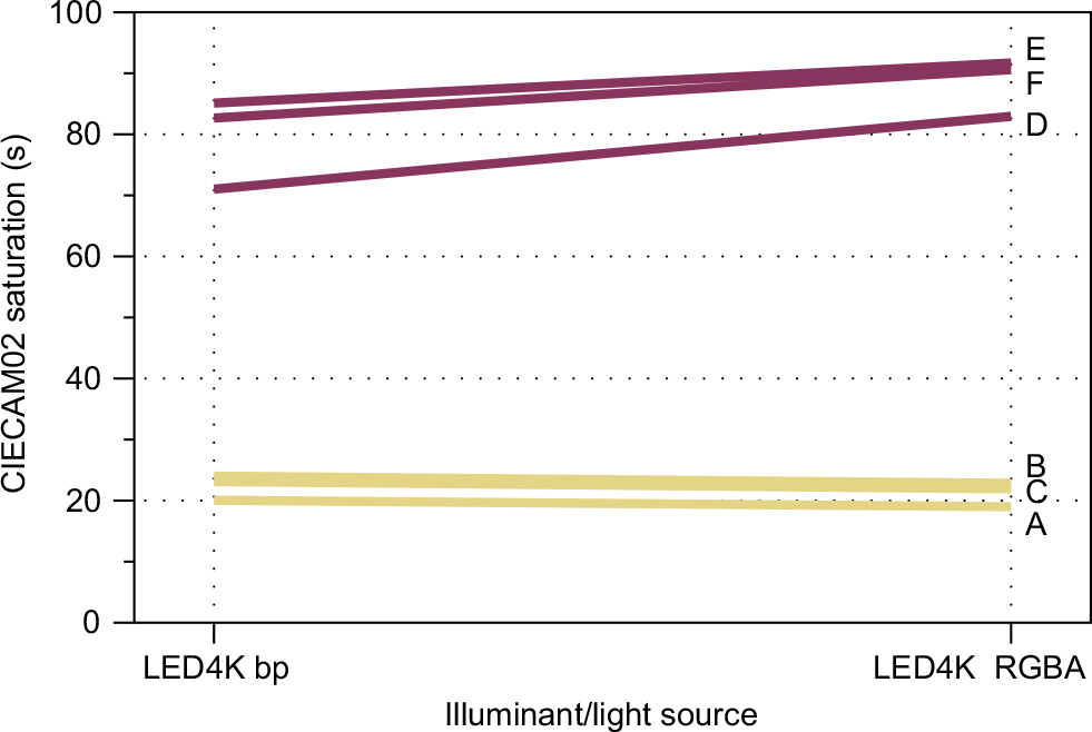 | Figure 29 A more detailed illustration on the effects of color rendering index, or differences in the spectral power distributions, of the 2 LED illuminants with correlated color temperatures of 4000K, but with CIECAM02 saturation (s). Abbreviations: CIECAM02, Commission Internationale de l’Eclairage Color Appearance Model 02; LED, light-emitting diode; RYGB, red-yellow-green-blue. |
Finally, Figures 30–35 show the hue composition bar charts for all 6 wines and this change in CRI for 4000K CCT LED lamps. Wine A – Riesling becomes significantly more reddish under the RGBA lamp. Wine B – Grechetto changes from slightly greenish-yellow to slightly reddish-yellow and Wine C – Chardonnay shows similar trends. All the red wines are yellowish-red under both light sources. Wine D – Pinot Noir loses a significant amount of yellowness under the RGBA lamp, Wine E – Zinfandel remains relatively constant, and Wine F – Shiraz gains some yellowness under the RGBA lamp. Each wine interacts with each illumination type in its own unique way and it should be clear that the color, the illumination level, and the spectral content (CRI) can all impact wine sensory evaluation, sometimes, in unexpected ways. Significant precision and accuracy improvements could be made in wine sensory evaluation if the illumination was, specified, standardized, and controlled, as is done in most applications where critical color judgments are required.
 | Figure 30 CIECAM02 apparent hue quadrature for Wine A – Riesling under the 2 LED illuminants with the same color, but different spectral properties. Abbreviations: CIECAM02, Commission Internationale de l’Eclairage Color Appearance Model 02; LED, light-emitting diode; RYGB, red-yellow-green-blue. |
 | Figure 31 CIECAM02 apparent hue quadrature for Wine B – Grechetto. Abbreviation: LED, light-emitting diode; RYGB, red-yellow-green-blue. |
 | Figure 32 CIECAM02 apparent hue quadrature for Wine C – Chardonnay. Abbreviation: LED, light-emitting diode; RYGB, red-yellow-green-blue. |
 | Figure 33 CIECAM02 apparent hue quadrature for Wine D – Pinot Noir. Abbreviation: LED, light-emitting diode; RYGB, red-yellow-green-blue. |
 | Figure 34 CIECAM02 apparent hue quadrature for Wine E – Zinfandel. Abbreviation: LED, light-emitting diode; RYGB, red-yellow-green-blue. |
 | Figure 35 CIECAM02 apparent hue quadrature for Wine F – Shiraz. Abbreviation: LED, light-emitting diode; RYGB, red-yellow-green-blue. |
Conclusion
If there is to be one conclusion drawn from the measurements and analyses of this paper, perhaps it should be that a wine has more than one color. Specifically, 3 main points were illustrated and established colorimetrically.
- The multiplicity of wine color was illustrated through examination of 2 types of spectrophotometric measurement techniques with 8 different illumination and viewing geometries. None of these 2 situations produced the same measured color. This clearly illustrates the need for standardized and controlled measurement conditions if wine color is ever to be systematically evaluated on a widespread basis.
- The point was further illustrated by examining the effects on color appearance of changes in the color, type, and level of illumination. Without doubt, the variation in these results shows that standard illumination type, level, spectra, and environmental geometry are needed for meaningful sensory evaluation and inter-comparison of results across laboratories or testing venues. This is not so different from some of the textbook recommendations reviewed in the introduction, but the results of this study show that those recommendations are far too loose for critical color evaluations. While no direct visual assessments were completed in this research, the computation results are compelling and undeniable. The effects observed in the data are far larger than the precision of either the instruments used or human observers.
- Short of creating an entire color-controlled tasting room, one could set up a small controlled environment for personal sensory evaluations of color. This could be accomplished with a high-quality desk lamp designed for critical color judgments of photographs and then using that together with a white background wall and white paper on the desk/table top. An example of one such lamp is the Fiilex V70 lamp illustrated in Figure 36 with summary data presented in Table 3. The lamp consists of an RGBA LED that can be set to 4 colors (nominally 3000, 4000, 5000, and 6500K) and with variably luminance levels (dimmer) and very high color rendering. In Figure 36 it is shown with a diffuser dome that allows one to hold a glass of wine up to a bright light that is not too bright for careful judgments. It is shown in the viewing booth with D65 illumination on, so that the 4 colors of the lamps can be judged in a common, controlled environment. This lamp, or something similar, with a white paper background underneath and on the wall could make an excellent, consistent, and portable, wine color viewing system allowing control of all the variables discussed in this paper.
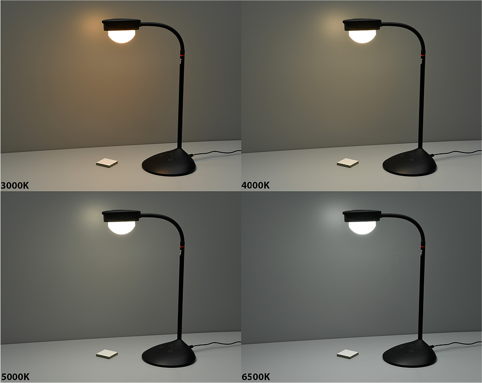 | Figure 36 Images of the Fiilex V70 desktop viewing lamp in the D65 viewing booth. Notes: The nominal variable correlated color temperatures are illustrated as labelled. |
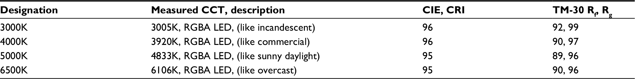 | Table 3 Spectroradiometric colorimetric measurements of the Fiilex V70 viewing lamp that provides an example of a portable lamp that is outstanding for wine sensory evaluation Notes: Included are their names, CCTs, descriptions, CIE CRI, and IES TM-30 color Rf, Rg). Abbreviations: CCT, correlated color temperature; CIE, Commission Internationale de l’Eclairage; CRI, color rendering index; IES, Illumination Engineering Society; LED, light-emitting diode; Rf, fidelity index; Rg, gamut index; RYGB, red-yellow-green-blue. |
Acknowledgments
The author thanks David R Wyble of RIT and Avian Rochester for his assistance in setting up and executing the measurements. The staff and instructors of the New York Wine and Culinary Center as also thanked for helping to inspire this work.
Author contributions
The author selected the wines, designed and executed all the experimental protocols, completed all computations, made all the figures, wrote the paper, and made sure that the remaining wine was properly disposed of. The author contributed toward data analysis, drafting and revising the paper and agrees to be accountable for all aspects of the work.
Disclosure
The author reports no conflicts of interest in this work.
References
Kennedy JA, Saucier C, Glories Y. Grape and wine phenolics: history and perspective. Am J Enol Vitic. 2006;57:239–248. | ||
Rolle L, Guidoni S. Color and anthocyanin evaluation of red winegrapes by CIE L*, a*, b* parameters. J. Int Sci Vigne Vin. 2007;41(4):193–201. | ||
Hunt RWG, Pointer MR. Measuring Colour. 4th ed. Chichester: Wiley; 2011. | ||
Berns RS. Principles of Color Technology. 3rd ed. Hoboken: Wiley; 2000. | ||
Fairchild MD. Color Appearance Models. 3rd ed. Chichester: Wiley; 2013. | ||
Martinez JA, Melgosa M, Pérez MM, Hita E, Negueruela AI. Note. Visual and instrumental color evaluation in red wines. Food Sci Tech Int. 2001;7(5):439–444. | ||
Huertas R, Yebra A, Pérez MM, Melgosa M, Negueruela AI. Color variability for a wine sample poured into a standard glass wine sampler. Color Res Appl. 2003;28(6):473–479. | ||
Hernández B, Sáenz C, Fernández de la Hoz J, Alberdi C, Alfonso S, Diñeiro JM. Assessing the color of red wine like a taster’s eye. Color Res Appl. 2009;34(2):153–162. | ||
Bain G. Wine Color Analysis Using the Evolution Array UV-Visible Spectrophotometer. Application Note: 518522009. Thermo Scientific: Waltham, MA, USA; 2009. | ||
Birse MJ. The Colour of Red Wine. PhD Dissertation: University of Adelaide: Adelaide, Australia; 2007. | ||
Jackson RS. Wine Tasting: A Professional Handbook, 2nd ed. Boston: Academic Press; 2009. | ||
Amerine MA, Roessler EB. Wines: Their Sensory Evaluation. San Francisco: Freeman; 2009. | ||
Spence C. On the psychological impact of food colour. Flavour. 2015;4:21. | ||
Morrot G, Brochet F, Dubourdieu D. The color of odors. Brain Lang. 2001;79:309–320. | ||
WSET. Wines and Spirits: Looking Beyond the Label. London: Wine & Spirit Education Trust; 2014. | ||
Jackson RS. Wine Science: Principles and Applications. 4th ed. Boston: Academic Press; 2014 | ||
Brou P, Sciascia TR, Linden L, Lettvin JY. The color of things. Sci Am. 1986;255(3):84–91. | ||
Goode J. The Science of Wine. 2nd ed. Berkeley: University of California Press; 2014. |
 © 2018 The Author(s). This work is published and licensed by Dove Medical Press Limited. The
full terms of this license are available at https://www.dovepress.com/terms
and incorporate the Creative Commons Attribution
- Non Commercial (unported, 3.0) License.
By accessing the work you hereby accept the Terms. Non-commercial uses of the work are permitted
without any further permission from Dove Medical Press Limited, provided the work is properly
attributed. For permission for commercial use of this work, please see paragraphs 4.2 and 5 of our Terms.
© 2018 The Author(s). This work is published and licensed by Dove Medical Press Limited. The
full terms of this license are available at https://www.dovepress.com/terms
and incorporate the Creative Commons Attribution
- Non Commercial (unported, 3.0) License.
By accessing the work you hereby accept the Terms. Non-commercial uses of the work are permitted
without any further permission from Dove Medical Press Limited, provided the work is properly
attributed. For permission for commercial use of this work, please see paragraphs 4.2 and 5 of our Terms.